Illustrations
A clear and consistent approach to illustrations helps us create a unified visual expression – regardless of subject or use. These guidelines support the creation of illustrations in cases where real photography isn’t suitable, and where pictograms are too limited or simplified.
Real photography is the preferred visual style in Scania communication. It plays a key role in reinforcing our values of authenticity, honesty and craftsmanship – showing that what we do is real, and that we stand behind it. Learn more on the Imagery page.
Pictograms can also be used to visualise communication, support content structure, or clarify complex ideas in a clear and accessible way.
In some situations, neither real photography nor pictograms are suitable. This could be when visualising future scenarios – such as city transport systems, information flows or environments that don't yet exist. In these cases, illustrations may be used to complement text and images, and help bring abstract concepts to life.
Illustration concept
Our illustration concept is based on the Scania brand platform and design strategy. The brand values pride, trust and progress are translated into the design pillars confident, reliable and progressive. These are then translated into illustration principles, to give guidance to the Scania illustration concept. By adhering to these principles we can create a visual expression for all of our illustrations, transcending a specific style or illustrator.
Confident
- Straightforward
- Simple
Our illustrations are simple and straightforward, taking complex topics and translating them into easily understood images to explain and visualise products, systems and interactions.
We avoid too artistic expressions. decorations, or unnecessary fluff.
Reliable
- Trustworthy
- Coherent
Our illustrations are trustworthy and coherent. By adhering to the look and feel guidelines we create illustrations with clear Scania presence. Our illustrations support the message with accuracy and care, helping to build trust and confidence in what we say and do.
We avoid cartoonish visuals or unrealistic motifs.
Progressive
- Agile
- Intelligent
By defining an overall look and feel we create an agile framework that can cover many topics and motifs. We always strive for our illustrations being intelligent and on-point to visualise things in the smartest and simplest possible way.
Look and feel
Design DNA
To align our illustration language with the larger visual context, we use our pictograms as inspiration. The pictograms give us a design DNA that guides us regarding shapes, motifs and degree of simplification. By grounding the illustrations in the pictograms we also make sure that the illustrations and pictograms can be used together seamlessly.
By extending our pictogram grid, but still using the same line thickness, we can create line drawings in a systematic and coherent way. This method also comes with the benefit that the illustrations and pictograms can have a consistent relationship and can be matched together in an illustration.
Colours
Our illustrations are built on Scania’s primary colours – blue and white – supported by colours from the blue and grey colour scales.
Main colours
Scania Blue
RGB: 4, 30, 66
HEX: #041E42
Scania White
RGB: 250, 250, 250
HEX: #FAFAFA
Read more about the colour scales in Tegel Design System.
Extended colour palette
When more colours are needed for more detailed or realistic illustrations, we mainly use the data visualisation categorical palette. If that doesn’t meet all needs, choose colours that feel calm, earthy and muted – rather than bright or overly saturated. This helps create a unified, authentic and trustworthy impression.
Skin tones
The following palette includes colours that could be used to represent different skin tones, when illustrating people (0 for neutral illustration and 1-6 for more realistic). If local adaptations are needed, you can adjust the colours while keeping the overall look consistent.
Shadows
For shadows, use the same colour as the surface, but in a darker tone (approx. 1-2 steps darker on the colour scale).
Types of illustrations
We mainly work with two types of illustrations: line drawings (outline) and coloured drawings. Coloured drawings may be used in a neutral colour setting (with colours from the blue and grey colour scales) or a realistic colour settings (with colours from the extended colour palette).
Outline
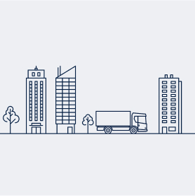
Our line drawings have the closest resemblance with our pictograms and use a single, uniform line thickness. Line drawings are best suited for explanatory illustrations of environments, products and processes.
Neutral
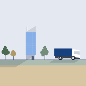
The addition of colour fill creates a less technical look and an opportunity for more detail, such as shadows. The neutral colour setting creates a clear Scania look and is our first-hand choice for coloured drawings.
Realistic
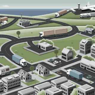
The realistic colour setting can be used when we need to depict environments and people in a more realistic manner. Lighter colours are preferred for larger areas like sky and ground. Slightly darker colours can be used for smaller natural objects.
3D renderings
Our 3D renderings are mainly used for product illustrations, to be able to visualise product details and functions. Examples include images and films that explain safety features, connected to road safety and similar.
When creating 3D renderings, it is important to choose a level of detail that supports the purpose. The result should still look like an illustration, to avoid the risk that it is mistaken for a poor attempt to imitate a real photograph. The focus should be on the product and how it works. Elements that do not help explain the function should be kept simple to avoid distractions. When needed, semantic colours such as green, yellow and red can be used in a subtle way to indicate status, for example to highlight a risk or warning.
Examples of 3D renderings in film for road safety
Perspectives
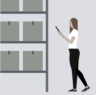
Our main perspective for illustrations is a flat, two-dimensional side view.
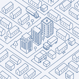
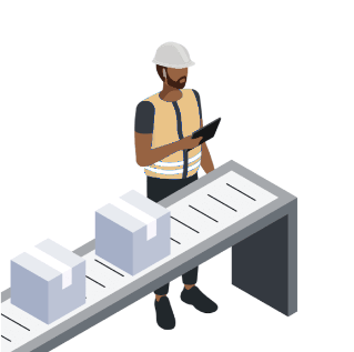
For more complex material, an isometric view can be used, showing the objects from a slightly elevated angle where all lines angle evenly, which helps you present depth and structure in a clear and readable way. This can be useful when there is a need to show spatial relationships and transport flows.
A top view can also be helpful when visualising cities, transport flows, geo-fence zones and similar areas.
Side view
Isometric view
Top view
Products and environments
Illustrations of environments are used when we need to depict non-existing, hypothetical spaces or environments that we cannot capture photographically. The main use-areas are for visualising transport systems, scenarios, and the functionality of our products and services. Both line drawings and coloured drawings can be used for visualising environments.
When creating illustrations of environments we strive for a straightforward and coherent expression. With our pictograms as a starting point we create our line drawings with a consistent look and feel, always using the same line thickness and level of detail for all objects. Our pictograms can also serve as an inspiration when creating new motifs.
When including Scania vehicles in the illustration, it is important to mind the vehicle’s design DNA so the result feels trustworthy and representative. Use product drawings or photos as reference to make sure the illustration captures the right character.
Our main perspectives when depicting environments are flat two-dimensional side views or isometric views.
Below are some examples of line drawings and coloured drawings in side view and isometric view.
People
Illustrations of people are used when we need to represent human without using a photography or a specific person. The main use-areas are for avatars, showing the interaction between people, and putting people into product and process contexts.
The preferred illustration types for depicting people is our coloured drawings. This allows us to work with different expressions, hair, clothes, skin tones etc.
When illustrating people we strive for a neutral and simple, yet not impersonal expression. With our pictograms as a starting point we can extract inspiration for the basic shapes of the head and body. To inject some personality into the illustrations, the hair can have a bit more organic shapes, and the body some more realistic shape, than the simplified pictograms. To add a sense of depth to the flat illustrations, subtle shadows can be added in a few selected places (e.g. under the chin).
Adapt the level of detail to the context and size of the illustration. Start from a simplified representation, but if the illustration is used in a larger format you can add more detail to the posture and the face, including eyes, nose, mouth and some filled shapes to indicate cheekbones and facial expression.
Our main perspectives when depicting people are flat two-dimensional side view and front view. When displaying people in an environment or as part of a larger scenery, an isometric view can be used as well.
Below are some examples of people illustrations.
Maps
Maps are a common element in Scania, ranging from navigation inside the trucks, desktop fleet management, location finding of dealers and workshops to infographic visualisations in presentations. A coherent map expression across all touch points improves the overall user- and brand experience. Read more in the Tegel Design System.
Infographics
Read more about how to combine images, texts, icons and other graphics into informative and coherent infographics on the page for Infographics. The Infographics page also includes guidelines and downloadable assets for visualising connected and autonomous vehicles, products features and other information.
