Infographics
Infographics are visual presentations of information, typically combinations of images, texts, icons and other graphics.
To align with our brand and design strategy, our infographics should be clear and realistic. We only use illustrations and infographics for information or to clarify the message, not for decoration or to achieve “cool” effects.
Components
Use the graphics components, brand colours, pictograms and typography, according to the guidelines and examples on this page, to create infographics with a clear and unified expression.
Lines and arrows
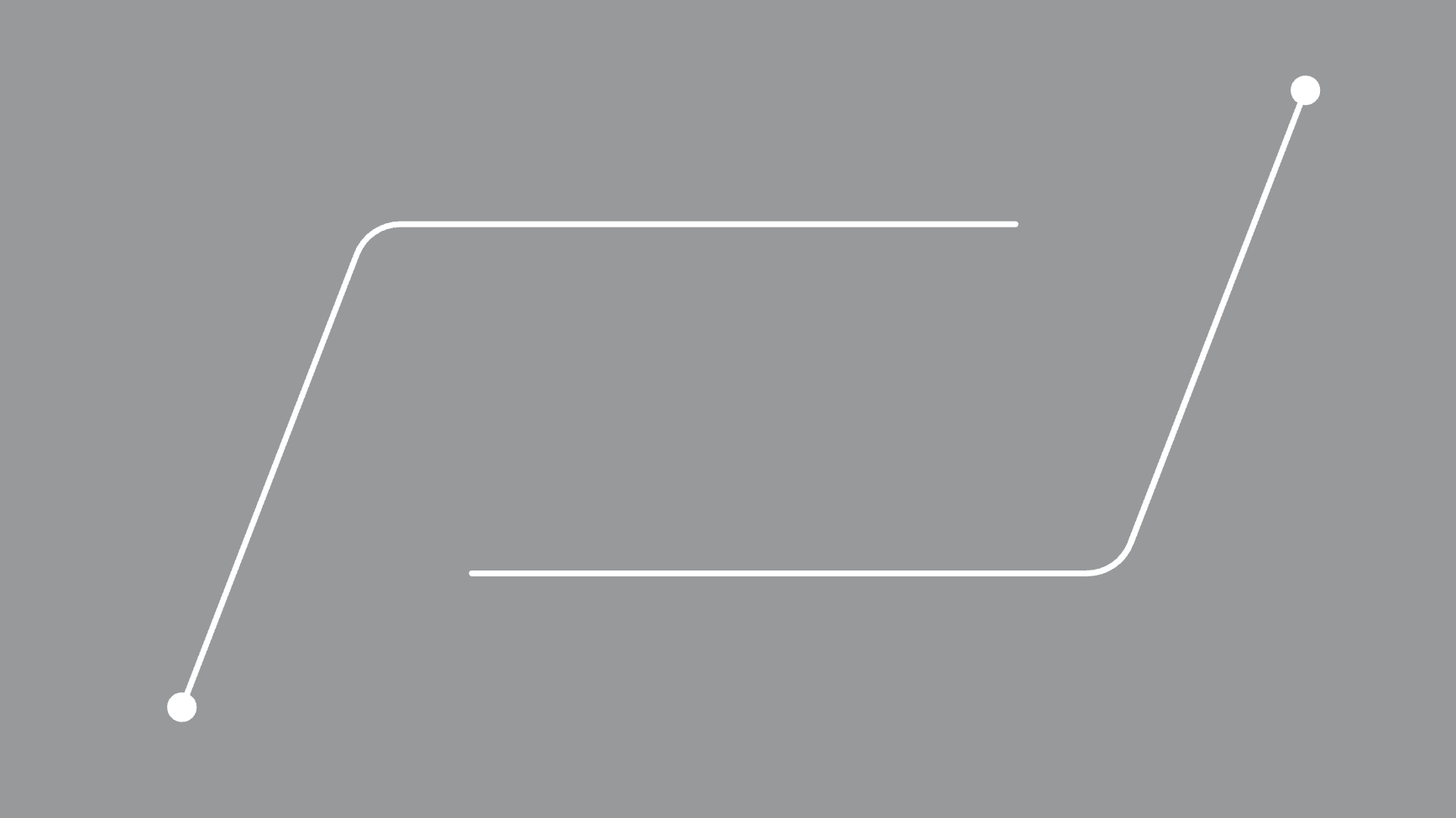
For a precise and sophisticated impression lines should be kept relatively thin and have rounded caps. When a line has an arrow head it should be open type.
 Use rounded caps and open type arrows.
Use thick lines, flat or square caps and arrows that are not open.
Use rounded caps and open type arrows.
Use thick lines, flat or square caps and arrows that are not open.
Boxes and frames
To achieve a precise and sophisticated impression, boxes and frames should have straight or only slightly rounded corners. If a round shape is needed, use a circle.
Use boxes with either straight or only slightly rounded corners to structure the information.
Use circles if needed to structure the information.
Use boxes with very rounded corners or ellipses.
Shadows and 3D effects
To avoid a cluttered impression, frames, shadows, 3D and other effects should not be used. If needed for legibitlity, a subtle shadow may be added to text, but it should then be keep to a minimum.
Pictograms
Pictograms could be used to highlight product features, structure text, explain complex processes etc.
Illustrations
When a real photo cannot be used, an illustration might be needed. Then make sure to follow Scania's illustration style for a unified expression.
Text
Focus on what’s most important and keep the text as short as possible. Don’t mix too many font versions and sizes, but try to keep it to two or three different sizes/fonts for a clear information hierarchy and an impactful yet sophisticated impression.
Digital applications
For digital applications, more useful components, such as chips and sliders, are available in Tegel, Scania's digital design system.
Image treatment
When placing text, icons or other graphics on an image, a dark rectangle overlay may be needed to achieve legibility. Use a black rectangle and choose opacity so that enough legibility is achieved. The need for opacity will vary depending on image, but normally a maximum of 30-40% opacity (or 60-70% transparency, if using e.g. PowerPoint) will be sufficient.
In the example below 30% opacity is enough to achieve legibility. 60% opacity makes the image too dark.
Use just as much opacity needed to achieve enough legibility (e.g. 30%).
Use no overlay or too little opacity so that any graphics or text isn't visible (e.g. 0%).
Use too much opacity, so that the image gets too dark/is not visible (e.g. 60%).
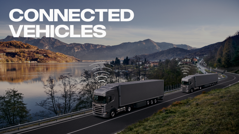
Connectivity and autonomous
Connected and autonomous products are normally communicated and visualised through a product image and possibly an explaining headline and body text. However, in some cases we might need to emphasise or clarify the product feature by adding some graphics to the image. Please note that the purpose of any added graphics should be to be more informative, and not to decorate the image to achieve a “cool” effect.
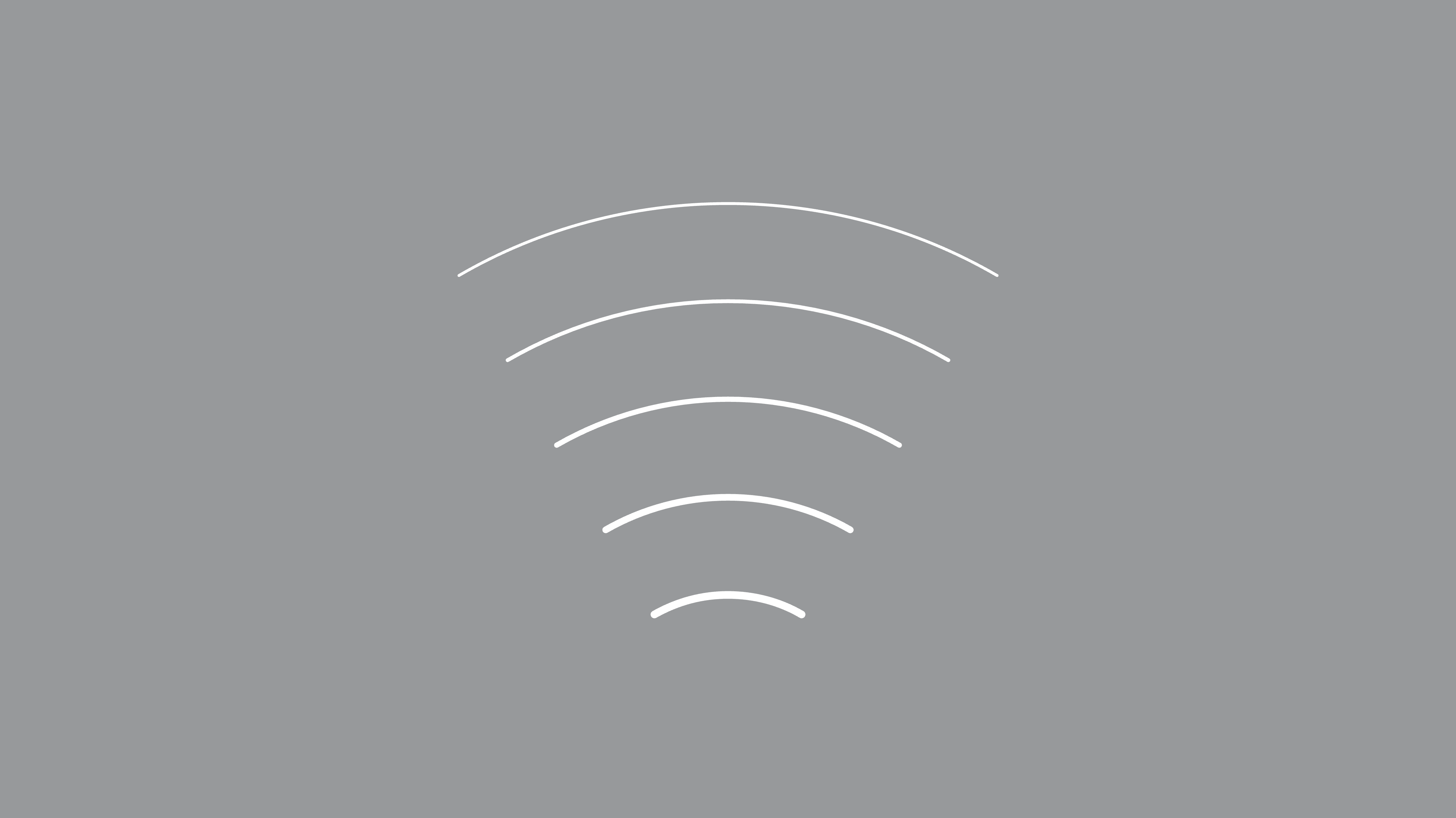
To clarify that a product is connected we use the signal (wifi) symbol (similar to the pictogram for connected vehicles).
To clarify that a product is autonomous we use the sensor symbol (similar to the pictogram for autonomous vehicles). If needed, the opacity for the sensor symbol may be set to e.g. 60% (to not cover the vehicle too much).
The sensor symbol is the primary symbol to use for autonomous vehicles in general. It may be added directly to an image as it is (as in the image above), or tilted/rotated and placed below a vehicle/on a horizontal level (as in the example below).
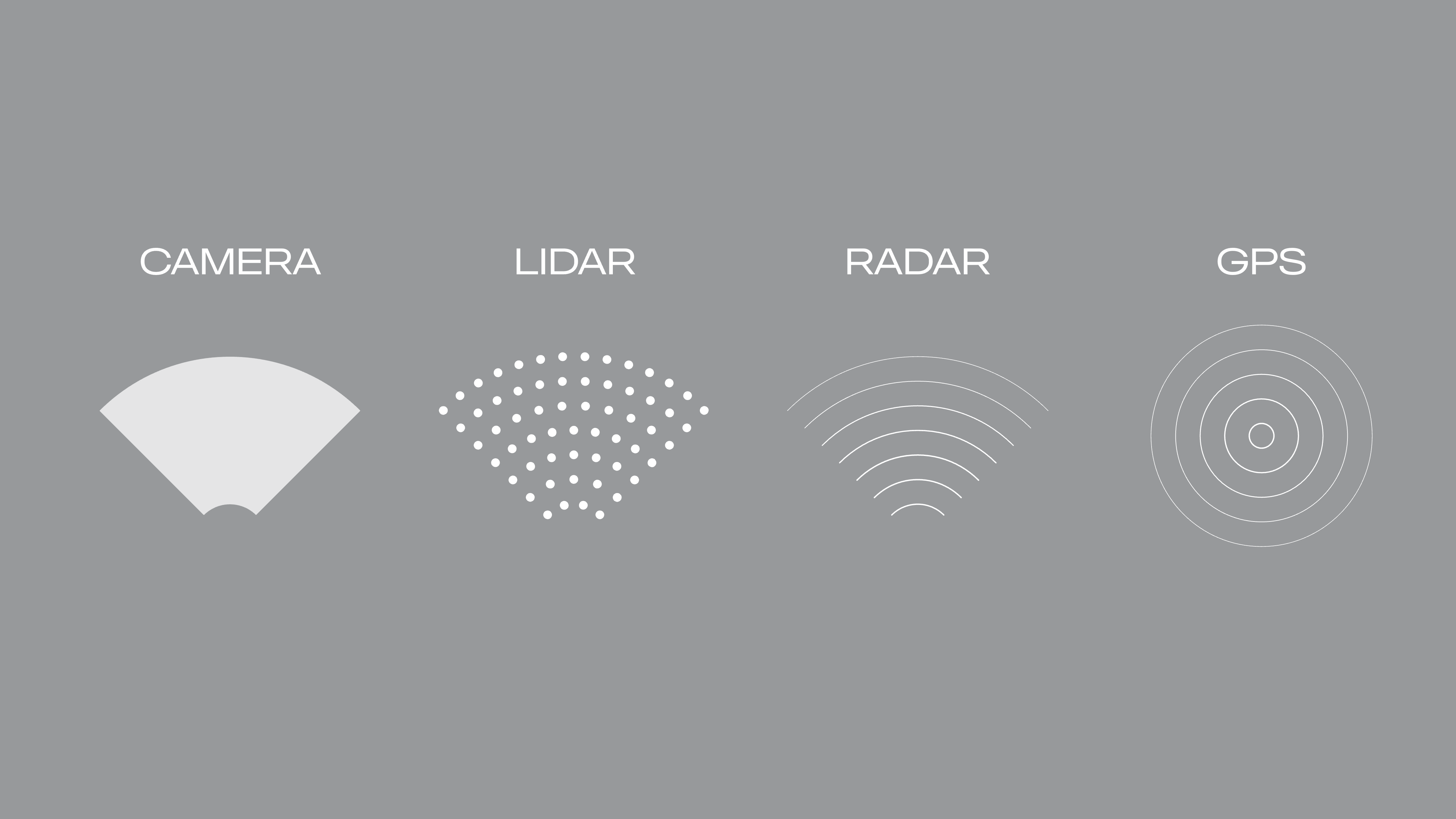
When there is a need to specify, explain and/or visualise the specific technology used, the following symbols are also available:
- Camera*
- Lidar
- Radar
- Gps
*) Add a suitable opacity/transparency to the symbol, depending on image, e.g. 50%
Download
Below you may download the symbols to use in your infographics for connected or autonomous vehicles.

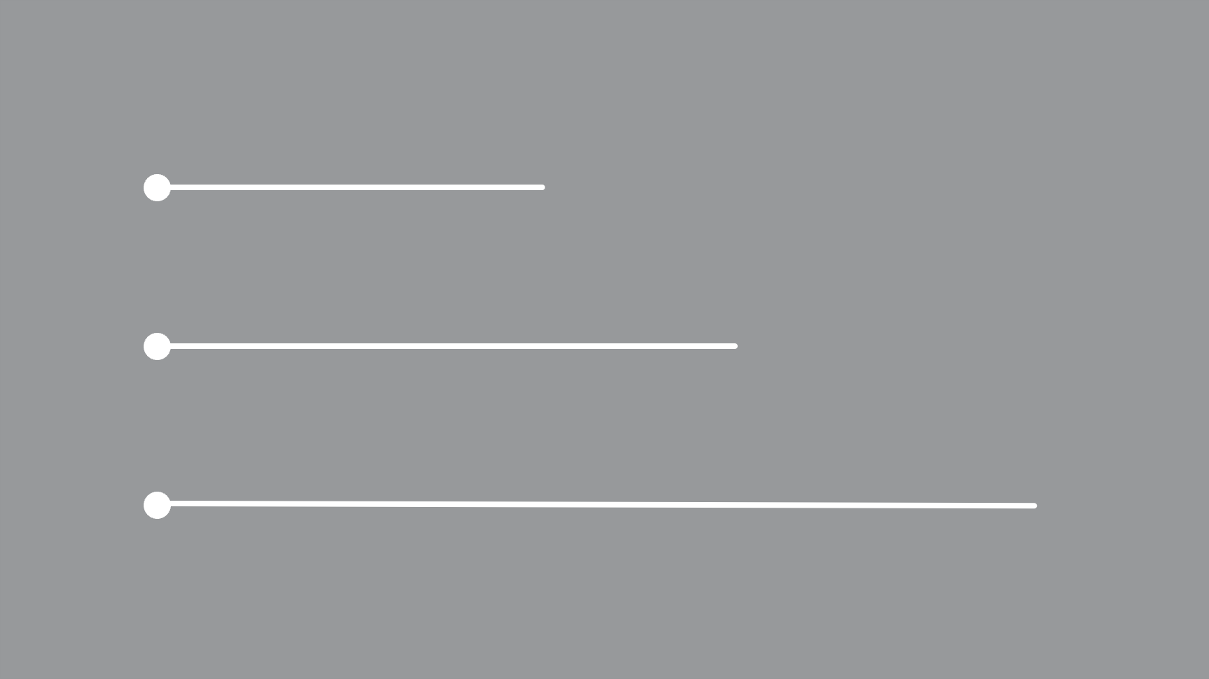
Several connected vehicles and networks may be visualised by using markers connected by lines. Please note that the lines should always be straight (not curved), solid (not dashed) and that they shouldn't cross each other.
Size and weight
Different line weights and sizes may be used for graphics to create a sense of motion (in symbols) and depth. Keep the lines thin and markers small in order to create a sense of precision.
Please note that any text (e.g. explaining labels) should always be kept the same size (and not be varied to create a sense of depth).
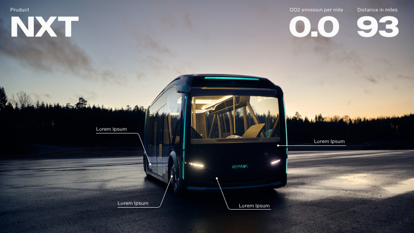
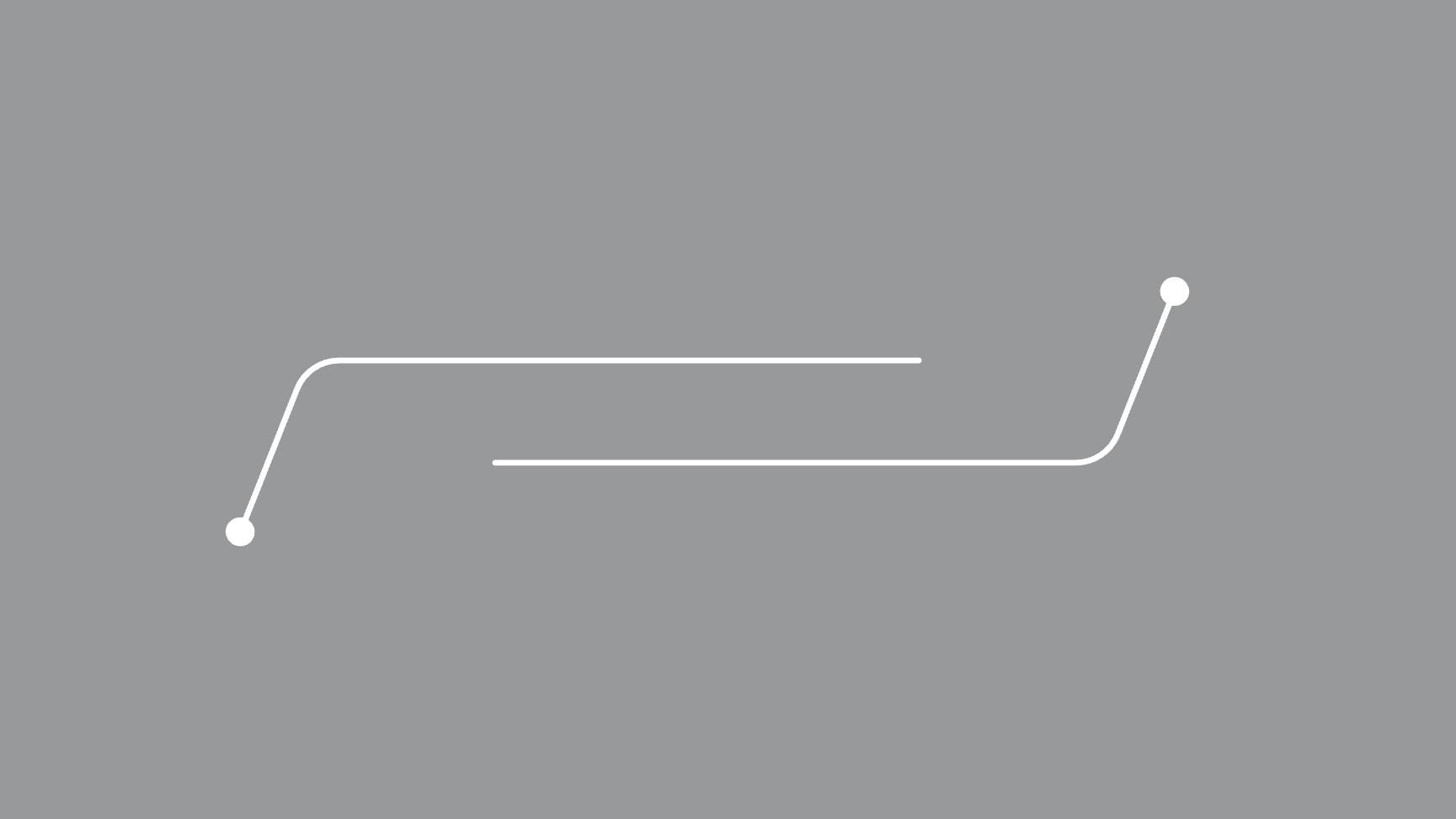
Features and information
Product features in images may be highlighted and explained by using pointers and explaining texts. The pointers have solid lines and filled markers. If necessary icons may also be used.
Text should always be placed horizontally. When possible, place the explaining text above the horizontal line of the pointer.
Download
Below you may download ready-made artwork for pointers to use in your infographics. When straight pointers cannot be used, use the angled pointers available for download and visualised on this page (with a fixed angle and corner radius).
For an impactful expression, numbers and key features are as a suggestion written in Scania Sans Headline Bold in a large size. Sub headers and explaining texts are then written in Scania Sans in a smaller size. This way we achieve a nice contrast and expression, but also a clear hierarchy in the information.
Motion
If you want to add motion to your infographics, please make sure to follow our motion guidelines for a coherent and premium expression.
Don'ts
Add a network grid on top of objects to visualise connectivity (it's only decorative and not informative).
Use curved lines. Always use the pointer components with straight lines or lines with preset angles.
Rotate text or text labels.