Exhibitions
The purpose of the exhibition guidelines is to harmonise the representation of our premium brand across all Scania exhibitions and events.
Despite our commitment to excellence, we are never being cold or flashy. We're the reliable partner, combining premium quality and attention to detail with a warm and inviting atmosphere. This is also reflected in our behaviour. We are confident, yet humble. We're not here to push sales, but we take time to understand our customers’ needs and daily pains, guiding them to what they genuinely need. We are trusted experts that prioritise their best interests and never oversell.
Click the links below to read more about our brand foundations (login required).
-
-

Brand archetype
Our archetype expresses the Scania brand as a personality. The human character traits that most accurately reflect Scania in an emotional way. -

Tone of voice
Whatever we’re writing or saying as Scania should sound ‘like us’. Our voice is real and relevant, accessible and inviting, and feels confident and secure.
Branding
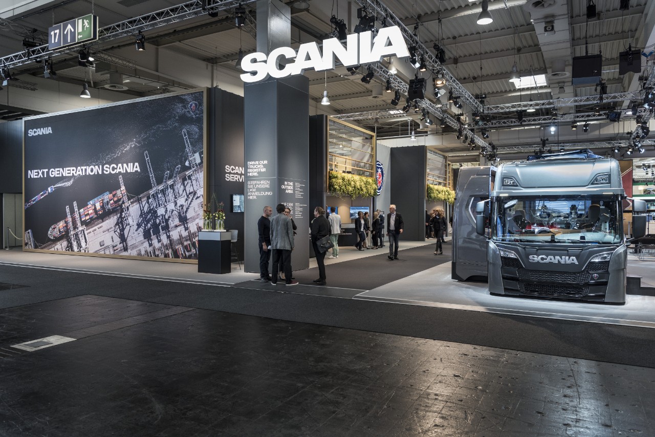
Stand overview
Below is an overview of the basic principles for branding of the stand.
Do's
- The main wall colour is Scania Dark Grey.
- Large pictures, holistic and detailed view, are used to showcase both our solutions, but also the surroundings that our customers and other stakeholders operate in.
- Message in short visible text in Scania Sans Headline.
- Original Scania signs used for branding of the stand (Scania symbol normally placed on a wall inside the stand).
- Plants can be used both on walls and in pots on the floor to add more structure and a natural (living) warmth to a space.
- Original Scania logotype hanging visible from aisles on a good height. This branding is visible from outside the stand.
- Original Scania wordmark sign hanging high up in the truss, visible from both front and sides in the main aisles. This branding is visible from outside the stand.
- Neutral dark colour, e.g. Scania Dark Grey, on carpet to keep the focus on the products.

Don’ts
- Don’t use other colours than the Exhibition base colours.
- Don’t use pictures other than the ones following the Scania image style.
- Don’t put the Scania symbol and wordmark in the corner of big pictures. The visibility is way too poor.
- Don’t rotate any of the Scania logotypes.
- Don’t place the Scania branding material too low. It will be hidden behind vehicles and crowd.
- Don’t put the Scania logotype or symbol on an image that doesn’t highlight it. The logotype must contrast with the background.
- Don’t use any other font than Scania Sans.
- Don’t put any of the Scania logotypes on the floor.
- Don’t use any garish colour on the floor. Keep it neutral.
- Don’t miss to brand the stand from the aisles and entrances.
Event assets
Visit the events page to download useful event assets and templates, e.g. for invitations and presentations.
Colours
Our brand colours help us differentiate from other brands and are used to create the desired brand expression, recognition and coherence in our communication and other expressions.
Base colours
The grey nuances are the main background colours in the stand. They are to be used on facades, pillars, walls and other large areas.
| NCS Pantone C Pantone U CMYK C CMYK U RAL |
S 7500-N Cool Grey 11 C Cool Grey 11 U 56, 47, 41, 46 56, 47, 41, 46 7015 |
| NCS Pantone C Pantone U CMYK C CMYK U RAL |
S 4000-N* Cool Grey 6 C* Cool Grey 6 U* 16, 11, 11, 27* 16, 11, 11, 27* 2000* |
| NCS Pantone C Pantone U CMYK C CMYK U RAL |
S 2000-N Cool Grey 3 C Cool Grey 3 U 8, 5, 7, 16 8, 5, 7, 16 7047 |
*) Please note that the Medium Grey colour used for exhibitions corresponds to the standard Scania Medium Grey colour, but has been slightly adjusted to better fit in exhibitions.
Secondary colours
These nuances are to be used as accent colours to highlight content such as artwork, flowers, furniture, frames, etc.
Please note that the Exhibition Orange and Exhibition Beige colours correspond to Scania Orange and Scania Beige respectively, but the colours have been slightly adjusted to better fit in exhibitions.
| NCS Pantone C Pantone U CMYK C CMYK U RAL |
S 7020-G10Y 350 C 350 U 80, 21, 79, 64 80, 15, 80, 55 6005 |
| NCS Pantone C Pantone U CMYK C CMYK U RAL |
S 1070-Y60R* 164 C* 166 U* 0, 59, 80, 0* 0, 57, 84, 2* 2003* |
| NCS Pantone C Pantone U CMYK C CMYK U |
S 4020-Y20R* 7562 C* 7562 U* 8, 29, 66, 19* 5, 19, 47, 15* |
*) Please note that the Orange and Beige colours used for exhibitions correspond to Scania Orange and Scania Beige respectively, but the colours have been slightly adjusted to better fit in exhibitions.
| NCS Pantone C Pantone U CMYK C CMYK U RAL |
S 9000-N Black C Black U 0, 0, 0, 100 0, 0, 0, 100 9005 |
| NCS Pantone C Pantone U CMYK C CMYK U RAL |
S 0500-N White C White U 0, 0, 0, 0 0, 0, 0, 0 9003 |
Materials
The exhibition material palette is based on the overarching Scania material palette and is used to guide the choice of material used in the exhibition stand.
Brushed steel
Area of use: Interior details such as counters and pots
Natural leather
Black, grey or dark
Area of use: Furniture
Concrete
Area of use: Paving stones
Chrome
Area of use: Furniture, bar tables etc.
Blonde wood
Natural (Swedish/Scandinavian origin)
Area of use: Furniture and floor in conference room
Glass
Technology and engineering
Area of use: Walls and railing
Textile
Natural.
Area of use: Curtains, carpets and cushions.
Text in the stand
Text on walls
For putting text on a big walls, the most important thing to keep in mind is not to add too much text. The customer is in the stand to look at our products, not to read lines of lines of text on our walls.
- Keep the text short and concise.
- Text should always be left-aligned.
- Text should be in one of our preferred colours, black or white.
- Scania Sans Headline Bold is Scania’s main font for headlines.
- It can span between 1–3 lines and may not be too small.
- Text can advantageously align to height to make the stand more harmonious.
Text on signs
The signs in a Scania stand should have the same overall impression as the rest of the stand.
Font size should be adapted to the reading distance and the text shouldn’t be too long.
Read more about typography and settings and use of the Scania Sans font on the Typography page.
Scania Shop
Scania merchandise is popular among our customers and other visitors and having a Scania shop helps us both in attracting visitors to the stand and promoting the Scania brand. Shops in the Scania stand should always reflect the premium brand in all display material and graphic elements, so don't forget the details. For example, always printed price tags, not handwritten.
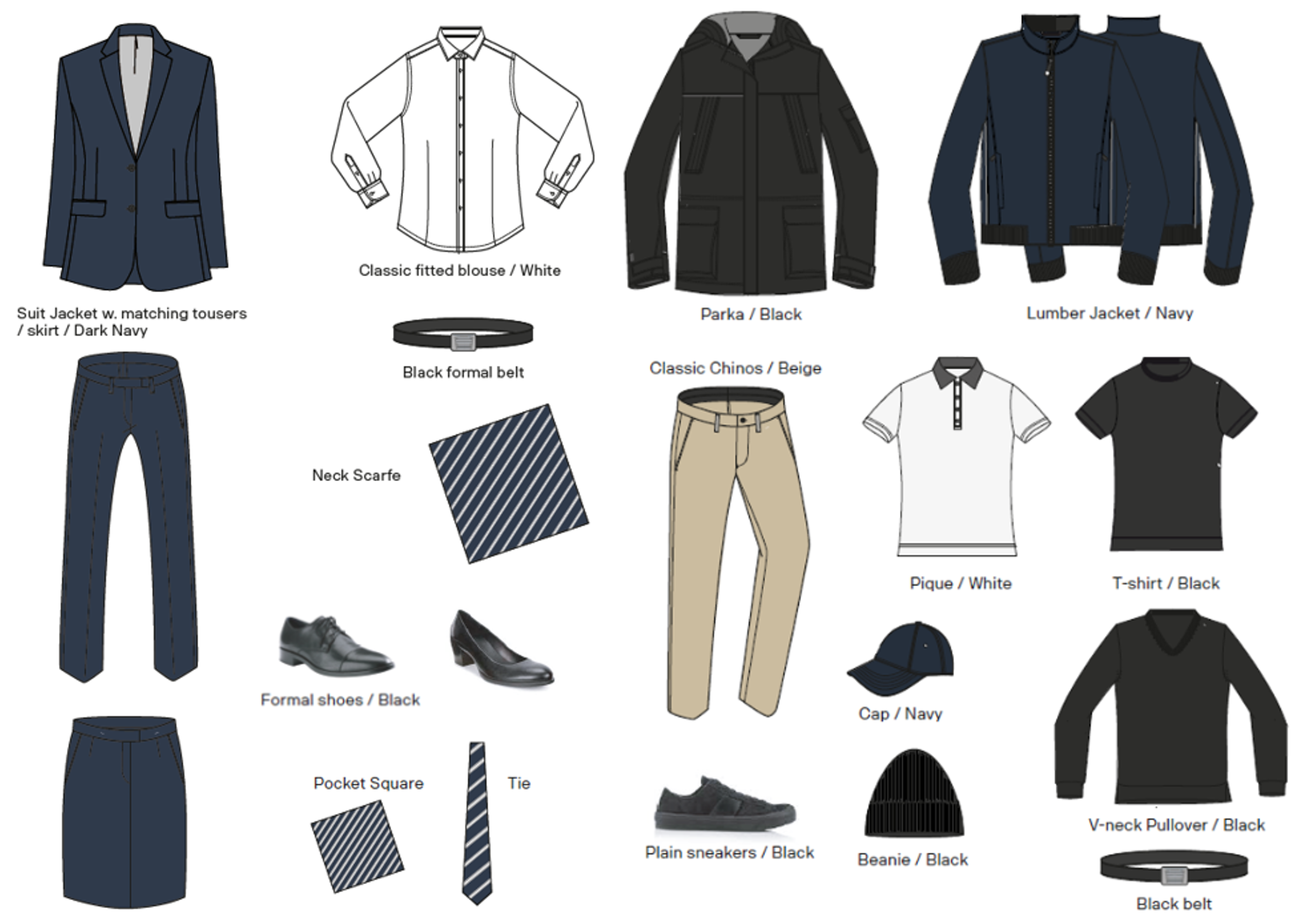
Clothing
For a professional and unified appearance of all personnel representing Scania at events and exhibitions the instructions in the Event and exhibition clothing guideline shall be followed.
It includes guidelines for different clothing categories (that the Project Manager for the event in question can choose from): Business formal, Business casual and Casual.
Download the guideline to read more.
Guideline
Vehicles
The design and the look of our vehicles is an important part of the brand experience. For choice and decoration of exhibition vehicles, read more about special edition vehicles.
Good practice
Indoor stand
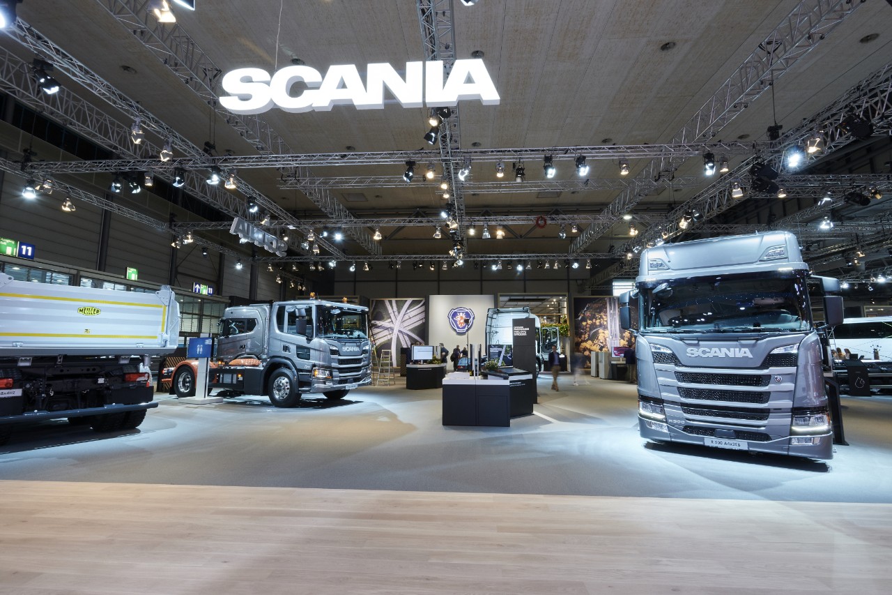
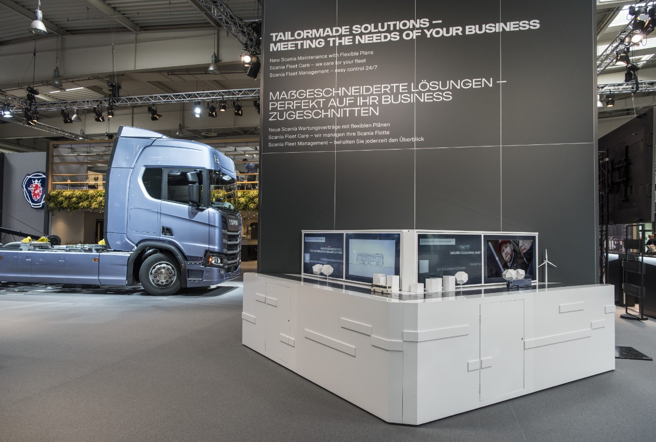
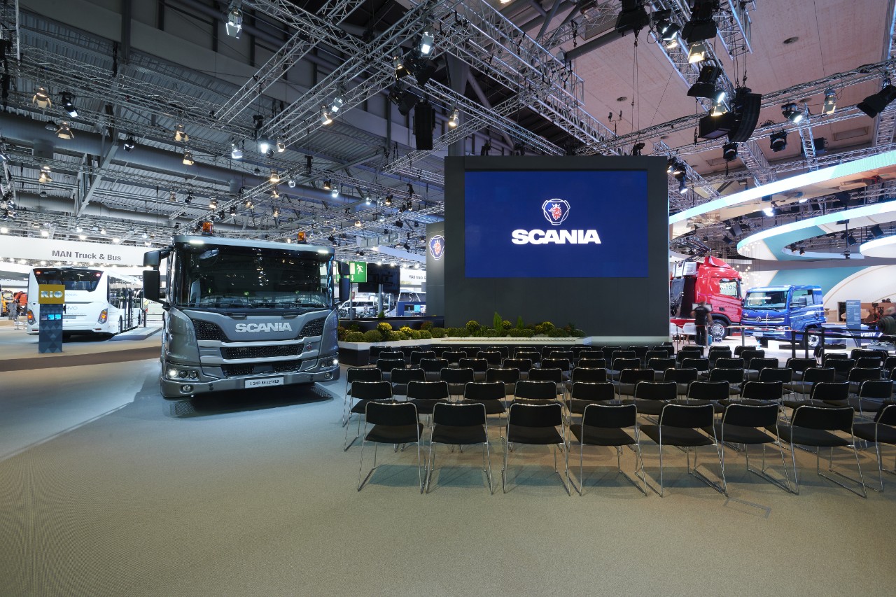
- Signage: Scania branding through original Scania signs: Wordmark LED sign hanging over entrance and visible from long distance and Scania symbol placed on wall inside the stand.
- Walls, pillars and floor in grey colours with text in white.
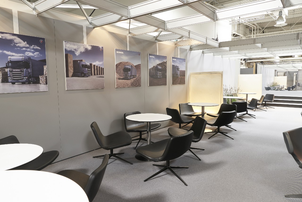
- Large pictures, holistic or detailed view (with and without text), showcasing the Scania offering and the environment in which our products and services are used.
- Product or exhibition unit visible from entrance.
- Areas with free space making room for big crowds (during presentations etc.).
- Use of Scania Sans Headline Bold and Regular respectively, for communication in two languages.
Lounge
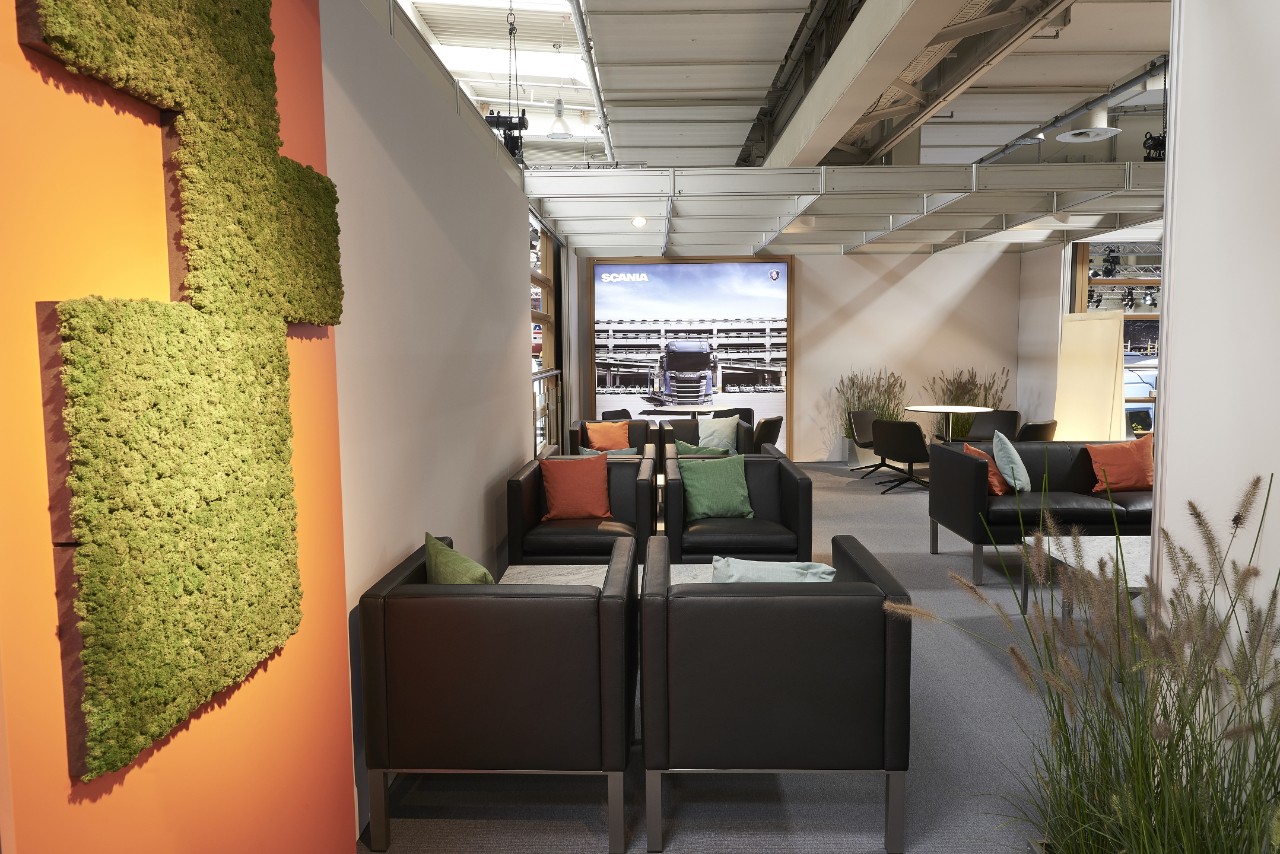
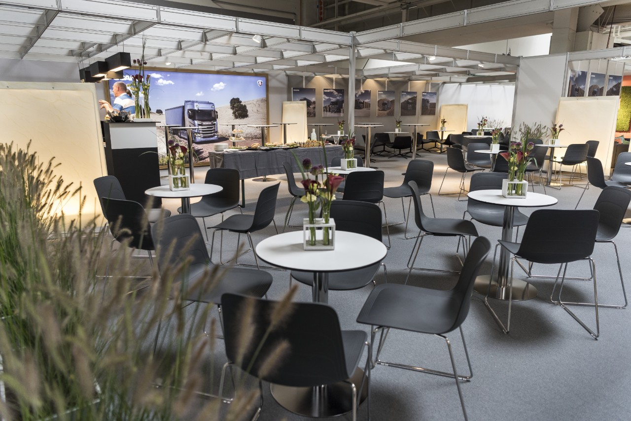
- Grey colour as foundation, but details with accent colours (orange and green).
- Large and small pictures, holistic or detailed view, (with or without text), backlit by built-in LED-lampsystem or front lit by spotlight.
- Comfortable seating in large and small groups.
- Elements such as flowers or floor lighting fixtures can be used as room dividers.
Conference room
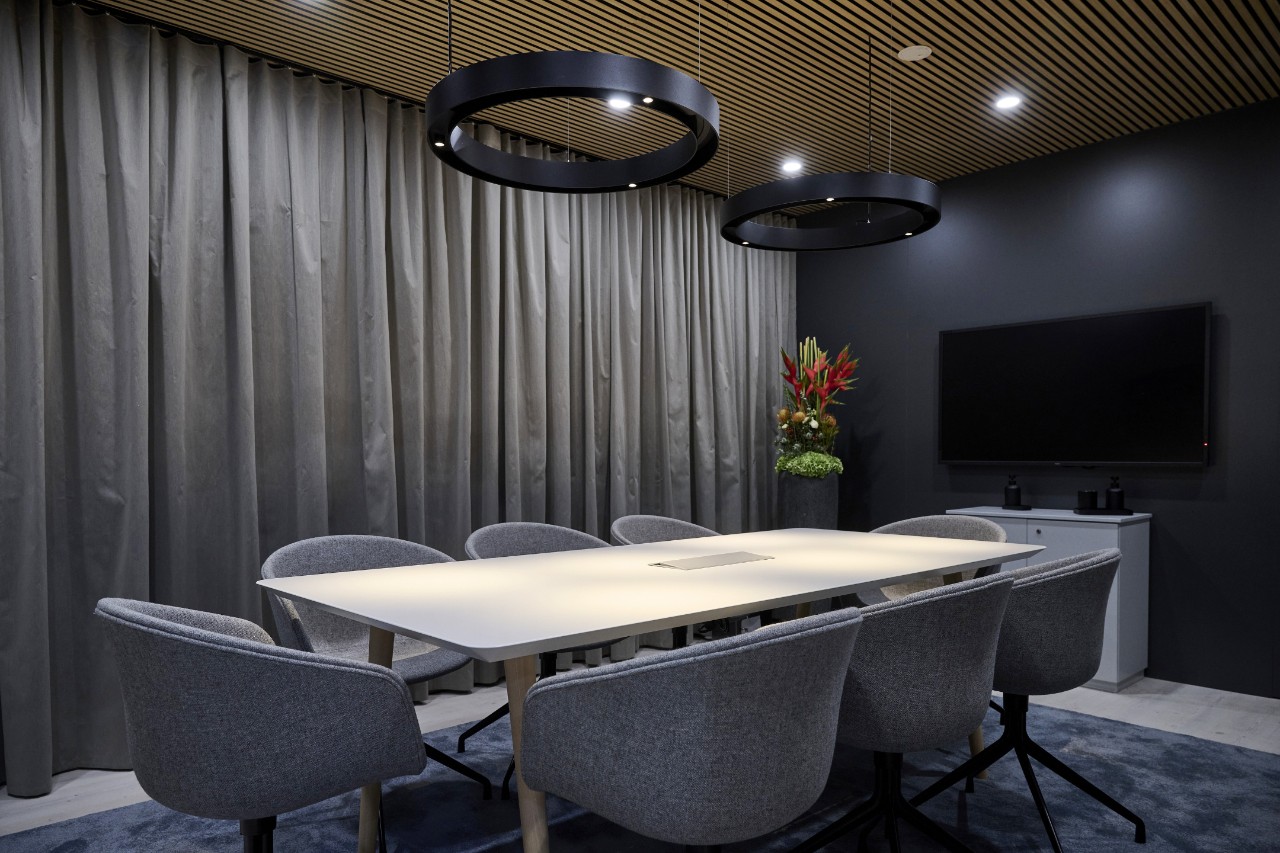
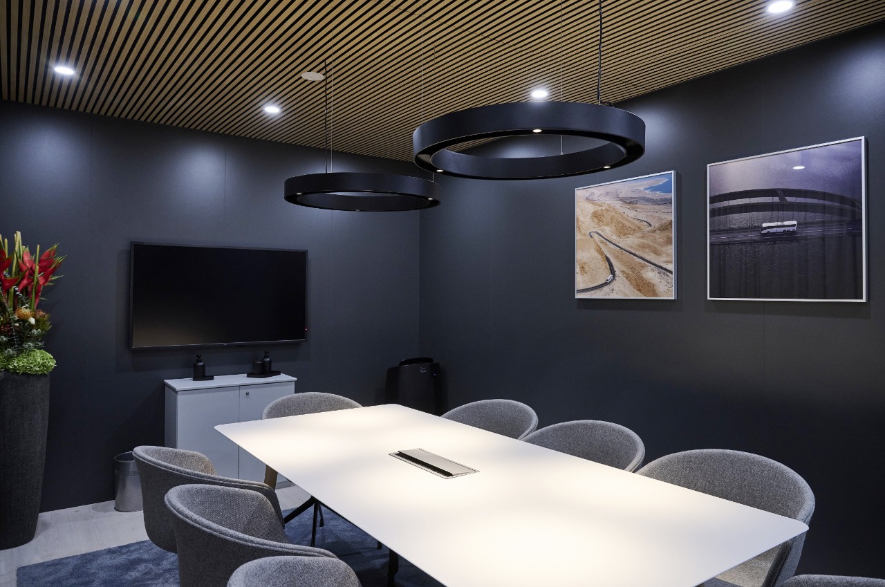
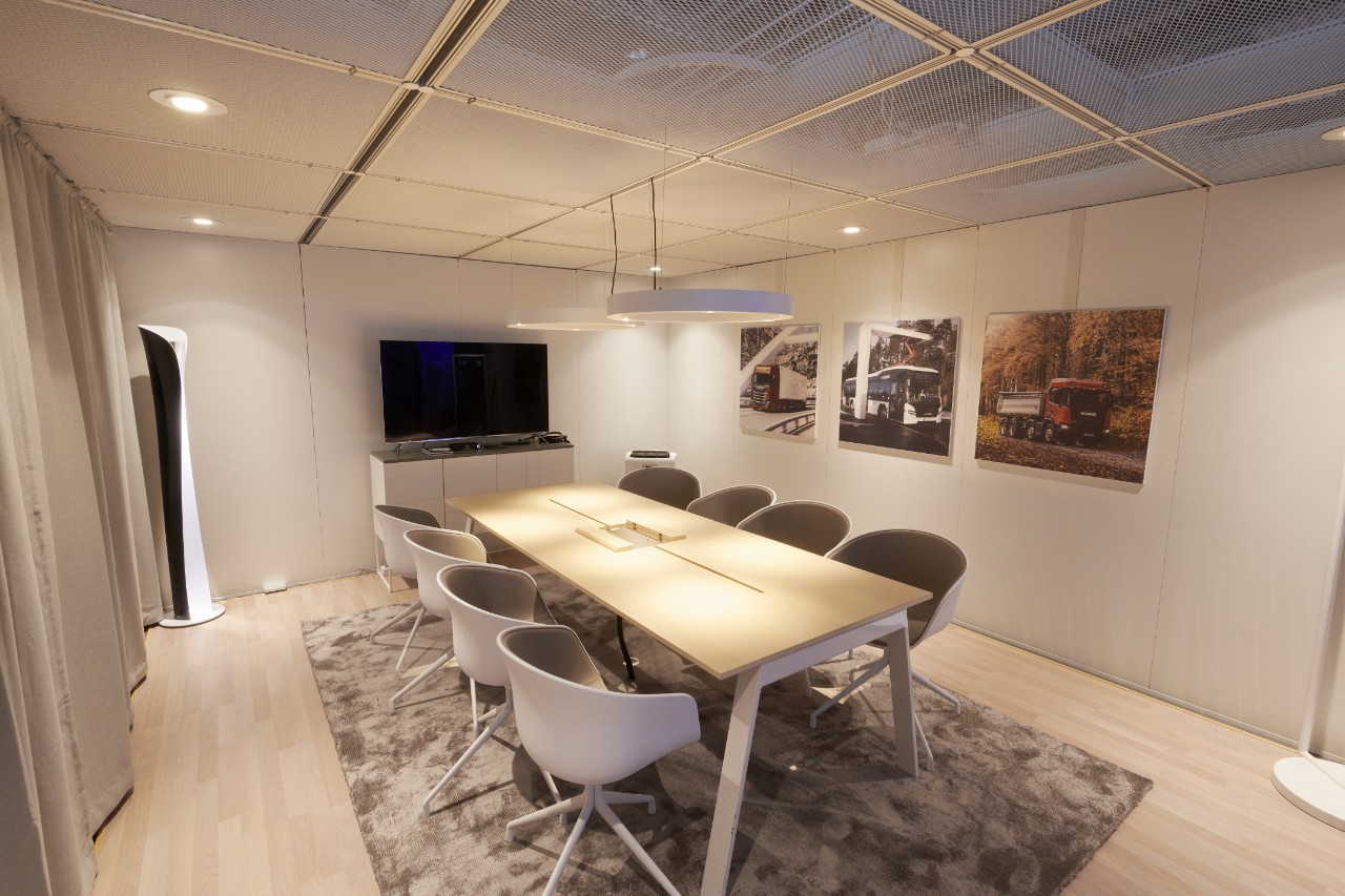
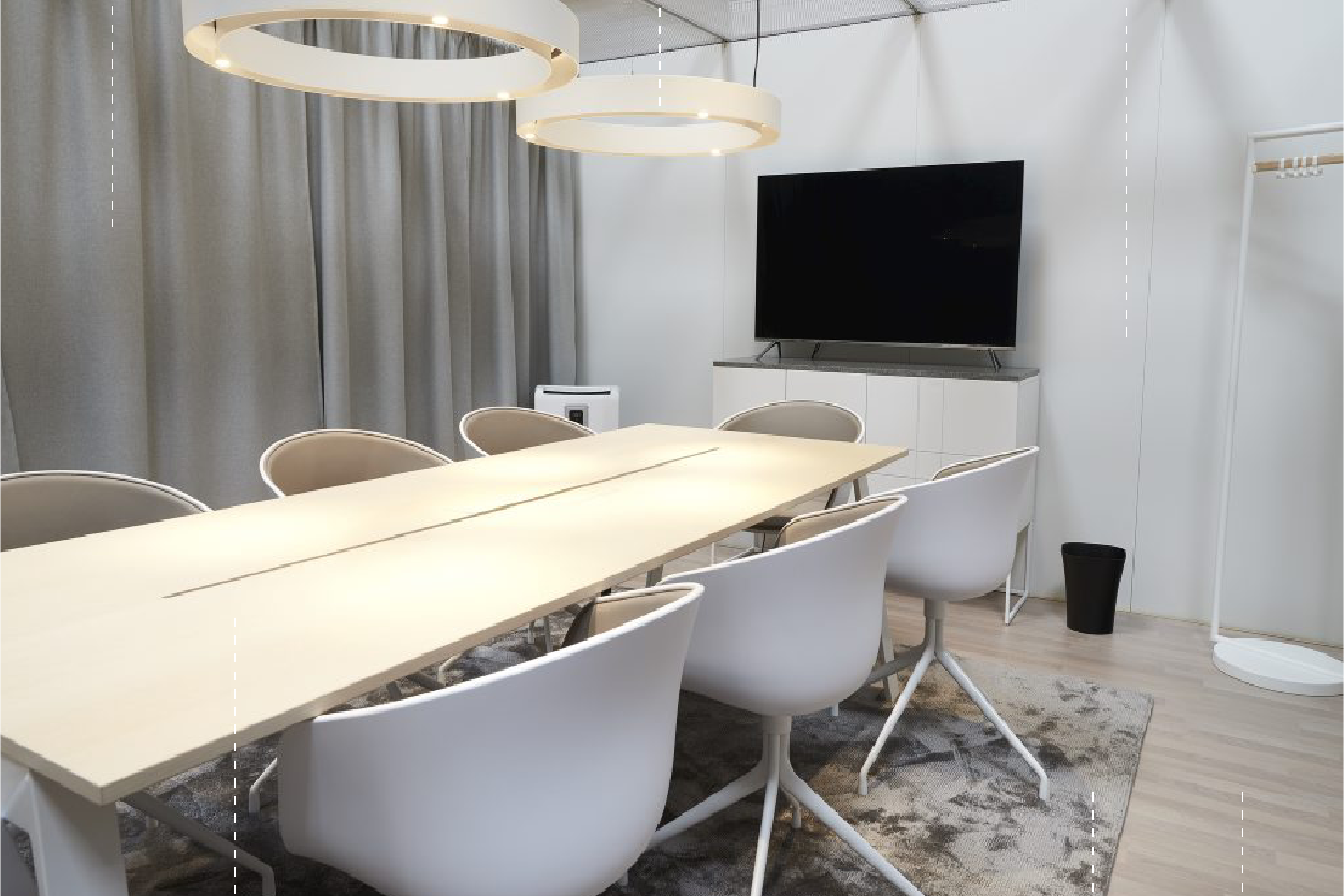
- Walls in grey colour.
- Curtain in grey or beige colour.
- Lighting fixture with warm light hanging over table.
- Blonde furniture in Scandinavian style.
More information
Visit the Reflex page for events and exhibitions for more information. In the PDF file "Scania Exhibition Guideline" you find more practical information that is useful when planning an exhibition, e.g. about area, layout, buildings, lighting, ramps and vehicles and exhibition units.