The shift element
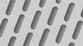
The shift element is a complement to the brand identity toolbox and can be used when there is a need for an additional graphic design element.
Progressive design
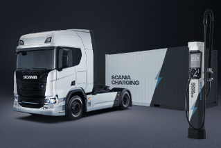
The main purpose of the shift element is to create a more progressive expression. Hence it is to be used sparingly and only in contexts connected to innovation and new technology. Examples are graphic design for charging solutions and electric vehicles and communication for E-mobility and Innovation Factory.
Shapes
The shift element may also act as guidance and foundation when a shape or angle is needed, e.g. the angle used for pointers in infographics. Also here it should be used sparingly, not in all designs, but only when needed.
The angle
The shift element is derived from the angle of the A in the Scania wordmark, which is 69 degrees.
Don'ts
To keep the feeling of progressiveness the use of the shift element needs to be limited and the graphic element applied sparingly. It is not to be used in all designs or as a standard design element or layout. For example, it should not be used in a standard PowerPoint presentation, in communication or striping of ICE vehicles, on business cards or corporate identity material.
Downloads
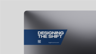
Below you may download a PowerPoint template with slides using the shift element. The slides may be used for presentations connected to innovation, new technology (e.g. E-mobility) and similar, but not in all presentations and not on all slides.
With shift element slides
Pointers for use in infographics may be downloaded from the Infographics page.
