Interior Identity
This guideline describes the interior design concept of the customer reception, retail shop and the back-office areas at Scania dealers and workshops. The design concept is standard, based on requirements connected to the Scania brand identity and safety, health and environment.
The interior identity guideline shall be implemented in the facility projects when building new facilities or refurbishing existing premises.
By using this guideline the planning and implementation of the interior will be more time and cost effective, and it will also make the communication with architects and contractors easier.
The complete guideline available on Teamroom (link below) also includes layouts etc.

Interior concept
Connecting the exterior and interior is part of developing one coherant image of the Scania brand. The whole interior: furniture, lighting, reception desk and brand wall, should convey the feel of Scania and its brand values – pride, trust and progress.
The experience made through touch, smell, sound and sight and by keeping the premises tidy should leave a positive impression that stays with the customers even after they have left the building.
Trust is translated into high quality in materials, aesthetics, comfort and ergonomics. Transparency shows a generous and honest company, with nothing to hide.
Scania plays a great part in the Swedish industrial history and heritage, based on a combination of traditional quality and innovation. Materials should be honest and durable, made to last over time, the design should be simple, clear and of high quality, the lines robust.
Developed on factors of identity and functionality, the concept is made to be long-term as well as contemporary. It allows continuous change by adding and altering components, in order to stay up-to-date.
Focus areas
The main purpose of the reception area is to greet the customer when entering the facilities. It should also provide service and information, as well as act as a shop register.
Make sure the area shows its very best, by keeping it clean and uncluttered, providing the correct signage and lighting it well.
The reception desk should be located straight ahead from the entrance, with the Scania brand wall directly behind it.
The white wall next to the brand wall is dedicated to local diplomas and- plaques. Be selective in what you mount, and use proper framing and hanging methods. Do not place your planning board here.
Read more in the complete guideline available via Reflex/Teamroom: Interior identity guideline.
The shop provides customers with Scania parts, accessories and merchandise. With the correct placement and assortment, it is a possibility to build brand awareness, but also generate extra income.
Location of the shop area should be close to the customer waiting area as well as the reception.
Lighting is very important in the shop environment to lead the customer in to the shop area, as well as highlighting the products.
Always make sure the shop is kept neat and tidy, shelves and hangers hold the right amount and type of products, that clothes are hung or folded neatly.
Read more in the complete guideline available via Reflex/Teamroom: Interior identity guideline.
The customer waiting area serves customers waiting for vehicles to be repaired. It can also be used for informal meetings between customers and staff.
The atmosphere needs to be comfortable, with access to warm and cold drinks, TV, magazines and comfortable seating.
The customer waiting area should be located to the side, with visual contact with both reception desk and shop.
The customer waiting area should always be placed so that natural daylight is possible. Artificial lighting should be warm and inviting.
Read more in the complete guideline available via Reflex/Teamroom: Interior identity guideline.
The sales station is a mix between sales office and smaller conference room, used for inhouse sales discussions and holds all information needed to display vehicle and service options.
The sales station should be easy accessed on the ground floor, with possibility to be closed off for privacy.
The type of furniture should be closer to that of conference rooms rather than offices – a round table and 2–4 conference chairs upholstered in either fabric or leather.
Read more in the complete guideline available via Reflex/Teamroom: Interior identity guideline.
The design of the conference room is similar to the sales station, but is larger in size and equipped with the basic technical aids needed for general meetings.
It is preferably located on the first floor, adjacent to offices.
Extra consideration should be taken to flooring, lighting and accessories, to create a comfortable environment.
Use textil or woven vinyl carpeting and combine general lighting with suspended armatures.
Read more in the complete guideline available via Reflex/Teamroom: Interior identity guideline.
The back office is a part of the reception area, and should be located in connection with the reception desk, preferably directly behind the brand wall.
Back office work stations are placed in open office solutions, with work stations generally in groups of two. To provide some level of privacy, table mounted screens are available.
Finish of the furniture in this area should be high. Make sure to keep back office work stations tidy, and avoid clutter and excess personal belongings, in order to give a professional impression.
Read more in the complete guideline available via Reflex/Teamroom: Interior identity guideline.
The canteen is in some instances accessible for customers, and should therefore be part of the customer service area.
It should preferably be located on the first floor, with natural daylight and overlooking the workshop.
The canteen should always be kept neat and clean, without clutter. Floor should be ceramic tiles and furniture materials easy to clean. Make sure to keep tables tidy and put magazines in stands.
The environment should be well lit using general lighting combined with suspended armatures hung on different heights to create a dynamic and interesting environment.
Read more in the complete guideline available via Reflex/Teamroom: Interior identity guideline.
The drivers’ room is reached by a separate entrance, located nearby the customer centre entrance. It is accessible to drivers who have to wait long hours or over night and wish to rest while their truck is being repaired.
The interior is simple, but should be kept clean and tidy. Although it is not a general public area, it should communciate the Scania brand values. Care for the customer is vital.
Materials should be of high quality, durable and easy to clean in order to present a neat impression for every new driver.
Read more in the complete guideline available via Reflex/Teamroom: Interior identity guideline.
The main focus for design of restrooms and changing rooms are that they are percieved as functional and clean spaces. Materials should be of high quality, durable, easy to maintain and clean. Good lighting is important for the impression of cleanliness.
The changing rooms shall be divided into two sections, one “clean” and one “dirty” section.
In the changing room, use ceramic tiles for floors. A grey tile with grey seams is practical.
Walls may be painted white, preferably in a higher shine value to be easy to clean. For walls in shower rooms, use white tiles.
Read more in the complete guideline available via Reflex/Teamroom: Interior identity guideline.
Like changing rooms, the main focus for design of restrooms are that they are percieved as functional and clean spaces. Materials should be of high quality, durable, easy to maintain and clean.
Use ceramic tiles for floors and walls. A grey tile with grey seams on the floor and glossy white tiles with light grey seams on wall are practical and give a neat impression. All fittings should be brushed stainless steel.
Make sure to provide good lighting in rest rooms and changing rooms. Check several times a day that restrooms are kept clean and fresh, especially if they are for public use.
Read more in the complete guideline available via Reflex/Teamroom: Interior identity guideline.
Interior signage
Signs with the Scania logotype should always be ordered from the global signage assortment.
The Scania brand wall is designed to fulfil the wanted representation of the Scania logo – placed at eyelevel, in direct vision from the entrance, it presents the customer to the brand.
Read more about Scania signage on Reflex.
The Scania brand wall in glass is placed behind the reception desk, to welcome visitors into the interior in a professional manner.
Above the reception desk, lighting is combined with informational signage in order to reduce the amount of objects hanging, at the same time providing sufficient task light at the work station. The signage system is designed to cover the basic needs of informational and directional signage at the customer centre.
There is a variety of suggestion sign layouts for different purposes. These have to be produced within each local project. Large size wall mounted and suspended signs are used in combination with arrows to guide customers to the correct function.
By doors, smaller signs with pictograms or text can be used to inform customers what is behind, these are to be used mainly at public functions like restrooms or conference rooms.
By sales and other office rooms, preferably post a sign with name of staff. Depending on size of the dealership, larger summarising signs may be used to guide customers to the correct person. All informational and directional signs are lacquered matte dark grey with silver lasercut graphics in the Scania Sans (regular) typography.
Read more in the interior identity guideline.
The Scania corporate identity material is used to achieve a professional, clear and easily identified Scania profile.
The material may be used by Scania representatives (e.g. dealers and workshops) in their premises, during activities, events and similar. These items are for internal use only and are not to be sold to end customers.
Scania Corporate Identity product assortment includes material for indoor and outdoor use, such as flags, sunshade, display stands, signs, banners, roll-ups, brochure racks, conference materials, stickers, bags etc.
Make sure to keep campaign graphics updated and remove those out of date to keep the interior uncluttered.
Materials
The material choices have been derived from the perception of Scania, and make up a limited but flexible palette. All materials are chosen to be of high quality, easy to maintain and last for many years of use, both visually and practically. Make sure to use the recommended materials or materials that are equivalent in colour, structure and quality.
Simple white walls and ceiling provide a neutral and sophisticated base to the interior program, as well as reflects and spreads natural and artificial light. Subtle and elegant dark grey tones in wood and stone, together with shiny metals and accents in bright red form a distinct and simple platform for the Scania brand.
Flexibility is key – materials that are easy to get hold of, floor materials for a number of different needs, a variety of upholstery fabrics to choose from depending on situation.
When talking about materials, there is also the different experiences to consider. Painting a wall in Scania blue does not give the same impression as translating it into blue glass, which with its shiny surface and depth gives associations to the sky.
Ceiling
Ceiling shall be white.
Recommendation: Acoustic panels Ecophon Focus Dg, 2400 x 600 mm. Orientation of boards should be leading towards reception desk. If lighting rails are used, these should be placed in joint lines.
Walls and skirting
Walls shall be painted white.
Recommendation: e.g. NCS 0500-N, shine 7 for walls e.g. NCS 0500-N, shine 40 for skirting.
Doors and framework
Doors and framework of glass partitions shall be matte dark grey (e.g. NCS 8500-N).
Recommendation: System walls Moelven Eurowand Glass Front.
Textile carpeting
Textile carpeting is favorably used in conference rooms and offices for noise reduction.
Requirement: In this instance, the carpet shall be darkgrey and wall-to-wall. Tretford Plus 512 Dapple Grey.
Floors
Floors in all public areas shall be beige ceramic tiles, e.g. NCS 3010-Y20R. Tiles shall be square and layed in a perpendicular grid in reference to the entrance facade.
Recommendation: Floor Gres, Chromtech Warm 2.0, 400 x 400 mm or 600 x 600 mm for public areas.
Floors
Floors in restrooms and dressing rooms shall be grey ceramic tiles, e.g. NCS 7500-N. Tiles shall be square and layed in a perpendicular grid in reference to the entrance facade.
Recommendation: Floor Gres, Chromtech Warm 4.0, 200 x 200 mm for restrooms.
Reception desk and back office
Work stations shall be blonde wood.
Customer waiting and sales station
Table tops shall be white.
Conference room
Table tops shall be white or blonde wood
Office storage and shelving
Shall be dark grey or blonde wood.
Back office table stands
Shall be dark grey or silver.
Wood
Work stations and back panels of shop interior shall be blonde wood. Orientation of wood should be horisontal / length-wise.
Construction board
Reception and shop interior shall be ingrained, black mattelacquered MDF.
Curtains
Off white curtain textiles.
Recommendation: Svensson Markspelle Karat 3020 (off-white) for curtains where sunlight and insight needs to be limited.
Laqcuers/Metals
Metal parts in shop shall be black (e.g. RAL 9021, NCS 9500-N).
Laqcuers/Metals
Treatment of shelves and shop fittings shall be silver.
Leather
Black.
Recommendation: Elmo Soft VII 99999 (black) for upholstery of lounge chairs and conference chairs.
Upholstery
Dark grey textile for lounge chairs and sofas.
Recommendation: Kvadrat Hallingdal 180 (dark grey) for upholstery of lounge chairs and sofa units.
Upholstery
Dark grey textile for lounge chairs and sofas.
Recommendation:
Kvadrat Remix 183 (dark grey) for upholstery of office chairs and conference chairs. Can also be used for work station partitions.
Upholstery
Red textile for conference chairs.
Recommendation: Kvadrat Pro 2 193 (red) for upholstery of conference chairs
Customer experience
Scania is a premium brand, meaning that everything that we do and deliver always is on a high standard offering high customer value, in every encounter, everyday.
The brand values, Pride, Trust and Progress, are the emotions we want to achieve, what we want people to feel about Scania, and experience in every encounter with Scania.
It's affected by our products and services, our behaviour, the interior design and standard, but also the details. Make sure that the interior always is welcoming and professional. That everything is functioning, clean and in good order - reflecting our premium brand.
- Set up cleaning routines. Clean shelves and furniture regulary
- Check marketing material so that it's up to date – remove outdated material to avoid a cluttered impression
- Check that coffee machine etc. works
- Make sure that staff is friendly and professional
- Use the graphic profile correctly on all material
- Remove assortment from the shop that isn't selling or is out of season
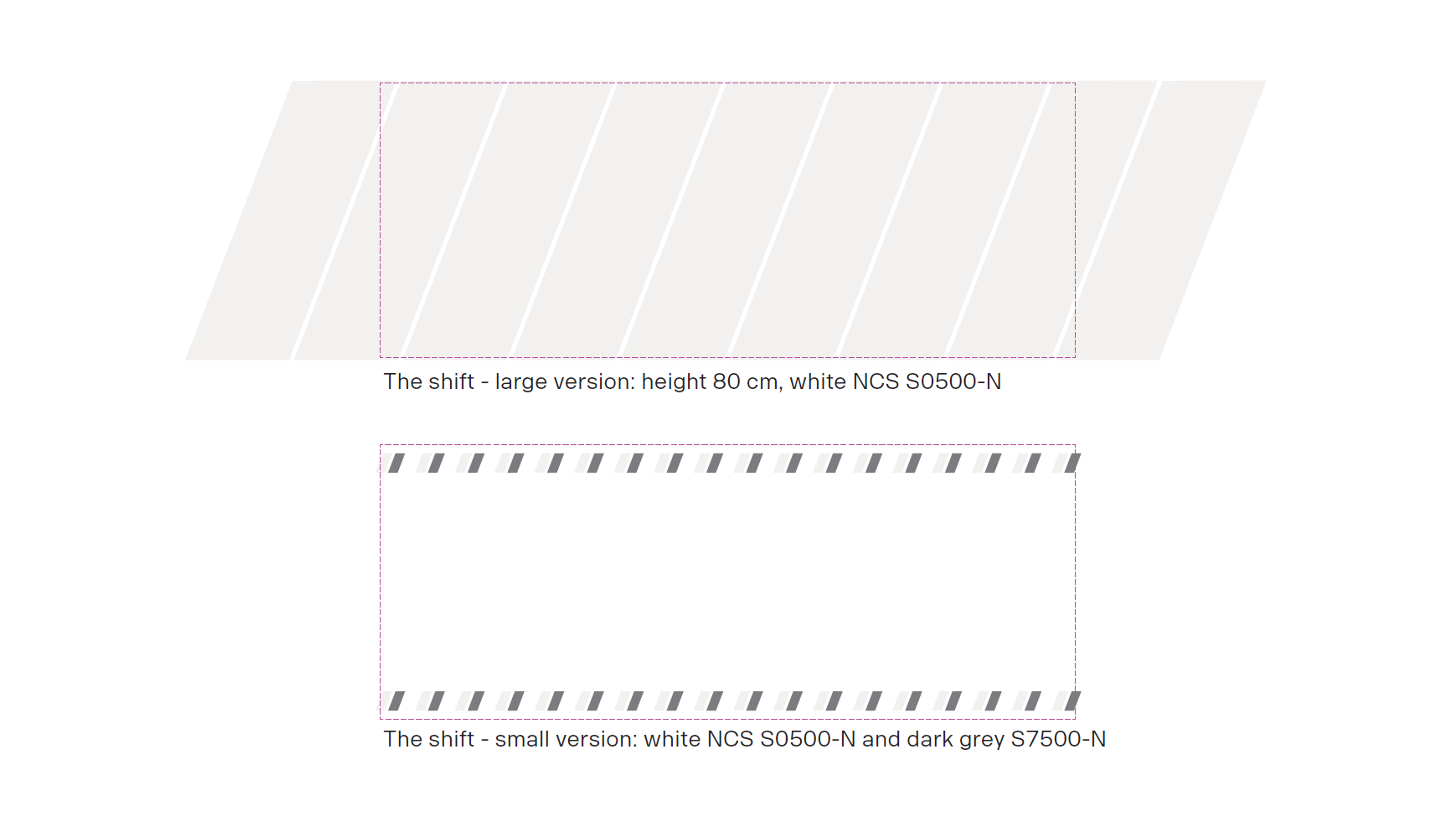
Glass manifestation
To meet health and safety standards, glass walls and doors often need to include contrast markings, also known as glass manifestation or foiling. These markings make the glass easier to see and help prevent accidents.
At Scania, when glass manifestation is needed in our premises, we can use our own pattern: “The Shift” (based on the shift element). It comes in two versions:
Large version (warm white)
Covers a larger part of the glass – 80 cm in height – which also provides more privacy. Ideal for spaces like meeting rooms and phone booths.Small version (warm white and dark grey)
A more traditional contrast marking applied in two rows. For meeting rooms and other glass walls and doors.
Large version applied on meeting room walls
Small version applied on meeting room walls
Large version applied on phone booth
Both versions are designed to meet Swedish legal requirements for glass manifestation. Local adaptations are allowed to meet local requirements. Make sure to check the regulations that apply in your country before use.
The Shift
Never use the Scania logotype – or any part of it – as a glass manifestation. It must not be treated as a decorative element. Using it in this way risks diluting the brand and undermines its impact.
Need help?
Concerning facility production and design of workplaces and offices respectively, please see the links below for more information.
Contact Scania Identity Helpdesk for questions about the Scania brand and identity or this page.