Motion
Our motion guidelines provide support for creating a coherent and premium experience through the use of movement, including animations of text, graphics, and digital components.

Our motion identity is based on the Scania brand platform. The brand values pride, trust and progress are translated into the motion principles precision, presence and drive, to give guidance to the Scania motion identity.
Building a premium experience through pride connects to our craftmanship, skill, and ingenuity, where precision is inherent. It lets us speak with confidence, and should be reflected in how we move. How we build sustainable partnerships and deliver on trust is manifested by our presence. To deliver on this, our motion needs to be mindful and composed. Scania is also a trusted partner for the future. This strong determination to keep advancing, this drive, can be enforced in how we move.
Motion concept
Our motion concept is the bridge between the Scania brand platform and how Scania moves and is the core of our motion identity.
Advancing with presence
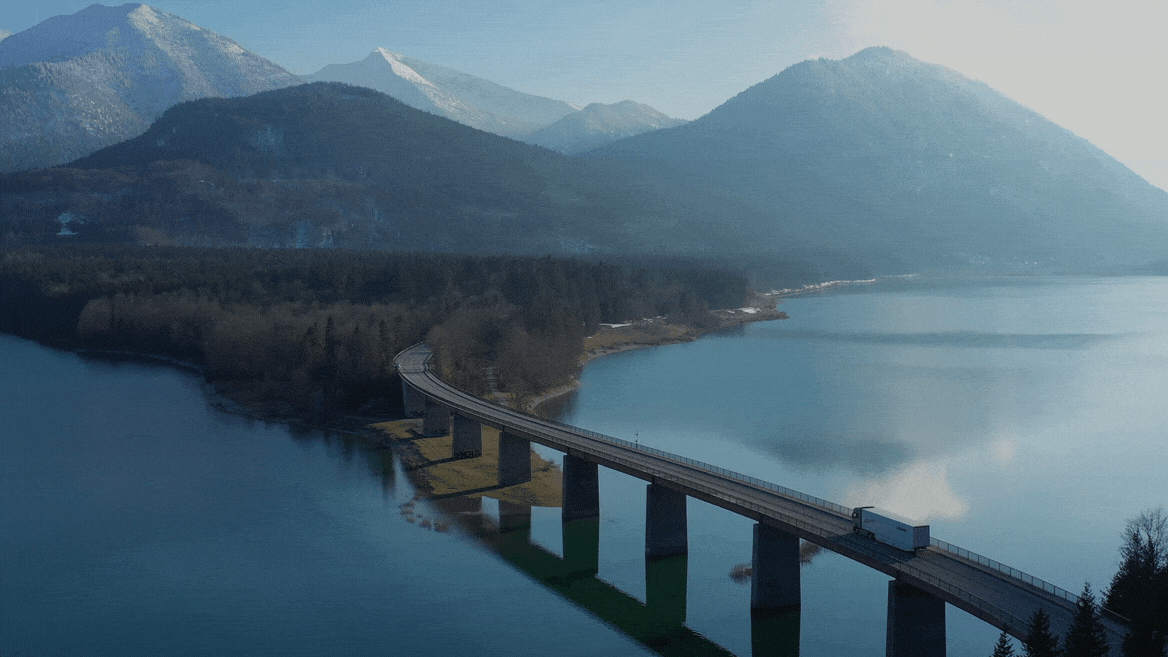
It is about building a premium experience in every encounter, where every movement comes with purposeful intent. We are constantly moving forward, driving the shift, and advancing. But we don’t force our way thoughtlessly or without consideration. Our drive is about precision, presence, and focus. Building on our legacy there is a sense of gravity, depth and solidity in what we do. We have a sense of duty, not only to bring peace of mind and trust, but to bring hope and aspiration. We want to give those who meet us a desire to be part of the journey.
This is the basis of our motion identity – advancing with presence.
Motion principles
To build a coherent, consistent and strong brand experience, the motion principles build on the values and ambitions from the brand platform. The principles aim to give guidance in how we can create a premium experience through movement, by translating the brand values into something that can be embodied in motion. These principles steer motion decision-making and production.
Precision
Our engineering expertise shines through in our systematisation of motion. It is to the point and distinct, and we move with a clear hierarchy and purpose. We avoid being overcomplicated or decorative.
Do
- Straightforward
- Purposeful
- To the point
- Simple
- Modular
Don't
- Vague
- Cartoonlike
- Experimental
- Decorative
- Cluttered
Presence
Our movement is grounded, with smooth transitions and a sense of weight. We take inspiration from the physical world, to find a tangible motion that feels safe and reliable.
Do
- Smooth
- Seamless
- Organic, tactile
- Composed, calm
- Weight
Don't
- Artificial
- Inconsistent
- Unfocused
- Faint
Drive
We move with drive. Our movement has a driving force that is rhythmic and has momentum. We want to give a sense of being visionary yet pragmatic, bringing aspiration and confidence to our motion.
Do
- Confident
- Driving force
- Momentum
- Rhythmic
Don't
- Flashing, glitching
- Forced
- Distorted
- Aggressive
Balancing the principles
When creating content and working with motion, the whole experience needs to be taken into consideration.
The principles can be balanced differently depending on the target audience, context, channel and intended message, allowing us to emphasise different aspects as needed. For example a formal announcement may need more precision and presence, but a brand film or social media post more drive.
Additionally, it's important to consider how footage, graphics and audio complement one another. They should work together to create a balanced and cohesive experience. For example, if the music has drive, the voice-over could have less drive and more presence instead, to ensure a better balance.
Example formal announcement
Example social media post
Primitives
Our primitives are the core of our motion expression. Together they align and connect elements to integrate the motion principles into applicable values for motion production.
Levels of motion
To ensure that we are flexible and efficient in our expression, we have three levels of motion; a default, expressive and simplified treatment. Depending on context and the nature of the asset, we can adapt the motion on this scale.
Simplified
The simplified treatment uses a minimal motion level. It’s less characteristic than our default treatment, but provides great support when working with information-heavy content or when there are tool limitations.
Default
Our default treatment is our most common motion language. It is our everyday expression that we use for all our communication.
Expressive
The expressive treatment is used for special occasions or where more motion is needed to create attention, e.g. in social media. Elements can follow rhythm and flow of footage, for a snappier and more bold expression.
Easing is an integral part of motion, and helps the movement of the object appear more natural. Easing is applied not only to positional motion, but also scale, rotation and opacity.
Recommendation: For more efficient work a recommended plug-in for everyday use in After Effects is Flow. The plug-in lets users easily store and apply ease curves to keyframes. That way a consistent ease-paradigm is maintained across all motion. The easing curves below are available for import into the Flow library. Read more about the Flow plug-in here.
Scania ease
The Scania ease is used when an element is visible from the beginning to end of a motion. The objects accelerate at the beginning and then gradually slow down at the end.
Bezier values: 0.40, 0.00, 0.00, 1.00
Velocity influence: 40%, 100%
Enter ease
This ease should be used when an element emerges on screen - coming at a high speed, and slowing down into a complete stop.
Bezier values: 0.10, 0.90, 0.20, 1.00
Velocity influence: 10%, 80%
Exit ease
This ease is for elements leaving the screen. It accelerates, and reaches a peak velocity at the edge of the screen. This implies that the motion of the element is continuing off screen.
Bezier values: 0.70, 0.00, 1.00, 0.50
Velocity influence: 70%, 0.1%
Easy ease
When enabling ease, the default easing option is Easy ease motion. It introduces a slight delay at the beginning and end of an element's journey. We only use Easy ease when fading in or fading out elements.
Bezier values: 0.33, 0.00, 0.67, 1.00
Velocity influence: 33%, 33%
Linear
Linear motion implies a constant movement. Examples of use can be elements like a progress bar or the constant rotation of an icon.
Bezier values: 0.00, 0.00, 1.00, 1.00
Velocity influence: 0.01%, 0.01%
Duration defines how quick or slow the motion is. The timing and size relationship are crafted to maintain brand integrity, allowing for consistency and scalability.
Please note: Duration varies based on the size of the element being animated. Smaller components move within a shorter time span, while larger elements move with a longer duration. The distance traveled also impacts the duration.
Balance the duration to the size of the object, creating a movement filled with drive and precision (example of Enter ease applied).
Add too long of a duration, which is perceived slow and without momentum (in this example Enter ease is applied with four times the duration).
Choreography in motion is the idea of guiding the user in one fluid direction. This requires multiple animations to fit together cohesively in terms of duration, direction, and easing.
Please note: It is possible to combine and work with different directions simultaneously, as long as we do this mindfully. Eg. we move clusters and groups of content in the same direction, one at a time or with a slight offset.
Use motion to guide the user (in this example from top-left flowing down diagonally to build the complete grid).
Let the objects appear randomly without a clear direction, and break the choreography. If we don’t follow a clear order, the user's attention will be scattered.
Logotype
Our animated logotype embodies our motion concept and guiding principles in a single animation. The logotype is primarily intended for use as an end logo in films, to ensure a strong unified global visual identity and clear sender. The logotype is designed to harmonise with our sound logotype, but stand just as well on its own.
Backgrounds
The primary version of the animated logotype is designed for a blue background, but it's also available on black, white and transparent backgrounds. Please note that only these versions are allowed. The logotypes may not be altered and no other motion may be added to the Scania logotype.
Blue background
Our default logotype version and strongest brand carrier.
Black background
A secondary version that may be used if black suits better with the footage.
White background
A secondary version that may be used if a lighter version suits the footage better.
Transparent background
May only be used on calm footage and must never cover any main object, such as a truck.
Formats
The motion logotype is available in different formats to cater for different needs. The standard format for film is 16:9, but it's also available in 9:16, 4:5 and 1:1 for different social media platforms.

Typography
When working with text on screen, it's important to be mindful of the duration and length of the message. Viewers need time to read the text and should not be overwhelmed by too much information at once. For longer text, consider dividing it into several screens to make it more digestible. Additionally, it's important to be cautious when using text on top of footage to ensure that the text is legible. Consider using footage or areas of the footage that have calmer space to make the text easier to read.
Read more about the general guidelines for typography and film.
Different levels of motion are available depending on context, the nature of the asset and the possibilities for adding motion.
Simplified treatment
The simplified treatment uses a simple and smooth fade-in and scales as one unit. It is suitable in text-heavy content with several messages, or when there are limitations in tools for creating motion.
Default treatment
The default treatment is our standard treatment when adding motion to text, graphics and the like. This treatment uses a confident, straightforward animation in an upward direction to create a sense of drive and optimism. A slight offset is applied line by line.
Expressive treatment
This treatment is used when we want to create something visually impactful or make a strong statement. It must be used with care, as it can easily be overused and also requires case-by-case refinement. Our expressive short copy treatment aligns the animation with the direction of the content to emphasise it. A slight offset is applied word by word.
Short copy
This treatment is large in size, suitable for titles and main messages. Depending on context, needs and possibilities it can be used with simplified, default or expressive treatment.
Simplified treatment
Values (Premiere Pro):
In: 0.5s, Scale 97->100%, Bezier Ease in, Opacity 0->100% Ease in
Out: 0.3s, Scale 100->97%, Bezier Ease out, Opacity 100->0% Ease out
Values (After Effects):
In: 0.5s, Scale 97->100% Enter Ease, Opacity Easy Ease
Out: 0.3s, Scale 100->97% Exit Ease, Opacity Easy Ease
Default treatment
Values (After Effects):
In: 0.6s, 40px/0.1s offset, Enter Ease
Out: 0.3s, Opacity, Easy Ease
Expressive treatment
In this example the text moves from right to left, in harmony with the direction of the vehicle.
Values: (After Effects):
In: 0.6s, 100-200px/0.1s offset, Enter Ease
Out: 0.3s, Opacity, Easy Ease
Long copy
For long copy the text is set in Scania Sans, which is suitable for slightly longer messages, quotes, URLs etc. To achieve a balanced level of motion, only simplified or default treatment should be used.
Simplified treatment
Values (Premiere Pro):
In: 0.5s, Scale 97->100%, Bezier Ease in, Opacity 0->100% Ease in
Out: 0.3s, Scale 100->97%, Bezier Ease out, Opacity 100->0% Ease out
Values (After Effects):
In: 0.5s, Scale 97->100% Enter Ease, Opacity Easy Ease
Out: 0.3s, Scale 100->97% Exit Ease, Opacity Easy Ease
Default treatment
Values (After Effects):
In: 0.6s, 40px/0.1s offset, Enter Ease
Out: 0.3s, Opacity, Easy Ease
Name and title
This kind of text treatment may be used to show names, titles, locations, facts etc. To achieve a good balance and subtle expression only simplified or default treatment should be used.
Simplified treatment
Values (Premiere Pro):
In: 0.5s, Scale 97->100%, Bezier Ease in, Opacity 0->100% Ease in
Out: 0.3s, Scale 100->97%, Bezier Ease out, Opacity 100->0% Ease out
Values (After Effects):
In: 0.5s, Scale 97->100% Enter Ease, Opacity Easy Ease
Out: 0.3s, Scale 100->97% Exit Ease, Opacity Easy Ease
Default treatment
Values (After Effects):
In: 0.6s, 30px/0.1s offset, Enter Ease
Out: 0.3s, Opacity, Easy Ease
aep
Graphics
When working with graphics, it’s important to work mindfully with the motion primitives. The hierarchy and size of an object play a significant role in determining how choreography, duration, and timing are applied.
Below are some examples of how motion may be added to infographics and other graphics used in film, presentations or data visualisation.
Infographics
Choreographed and tracked elements may be combined, but in these cases, it’s extra important to think about how to visually guide the viewer by animating one object at a time.
Read more in the general guidelines for infographics.
Pictograms
Depending on the size, number and importance of the pictograms, we can apply a simplified, default or expressive motion treatment. See examples below.
Icons are frequently placed in the context of many components and usually require a simplified motion treatment.
Read more about the general guidelines for pictograms.
Simplified
Our simplified pictogram animation uses minimal motion by fading and scaling the icon as one unit.
Values (Premiere Pro):
In: 0.5s, Scale 80->100%, Bezier Ease in, Opacity 0->100% Ease in
Out: 0.3s, Scale 100->80%, Bezier Ease out, Opacity 100->0% Ease out
Values (After Effects):
In: 0.5s, Scale 80->100% Scania Ease, Opacity Easy Ease
Out: 0.3s, Scale 100->80% Exit Ease, Opacity Easy Ease
Default
Our default pictogram animation uses a straightforward and directed fade-in and scale, similar to our animated logotype. The pictogram is divided in two parts, and animates in with a slight offset between the two parts.
Values:
In: 0.5s, Scale 80% to 100% Scania Ease, Opacity Easy Ease, 0.1s offset
Out: 0.3s, Scale 100% to 80% Exit Ease, Opacity Easy Ease
Expressive
The expressive pictogram animation has a slightly more elaborative animation that follows the shape and outline of the pictogram. This animation may be used for more prioritised content where the pictogram is in focus or more attention is needed.
Values:
In: 0.5s, Scale 80% to 100% Scania Ease, Opacity Easy Ease, 0.1s offset
Trim paths: 60-75% tio 100%, Scania Ease
Out: 0.3s, Scale 100% to 80% Exit Ease, Opacity Easy Ease
Data visualisation
To create a choreographed expression and visually guide the viewer, we purposefully animate one object at a time. Even in complex and detailed animations, we strive for a sense of direction (in this case from left to right) and a confident rhythm.
Transitions
The examples below show transitions between footage and solid colours only, as opposed to transitions between different footage, which require adaptation to the specific movement in each clip.
When working with these kinds of transitions, make sure you animate from a clean solid background, and that any graphics used on top, e.g. text, animates out before the transition, and not simultaneously.
The default transition is the standard version using smooth fade between a solid colour and footage. The expressive transition is based on The shift element (read more about it here) and can be used when a more expressive expression is needed, but should not be overused.
Default transition
Values:
In: 0.3s, Opacity, Easy Ease
Out: 0.3s, Opacity, Easy Ease
Expressive transition
Values:
In: 1s, Scania Ease
Out: 1s, Scania Ease
Events and presentations
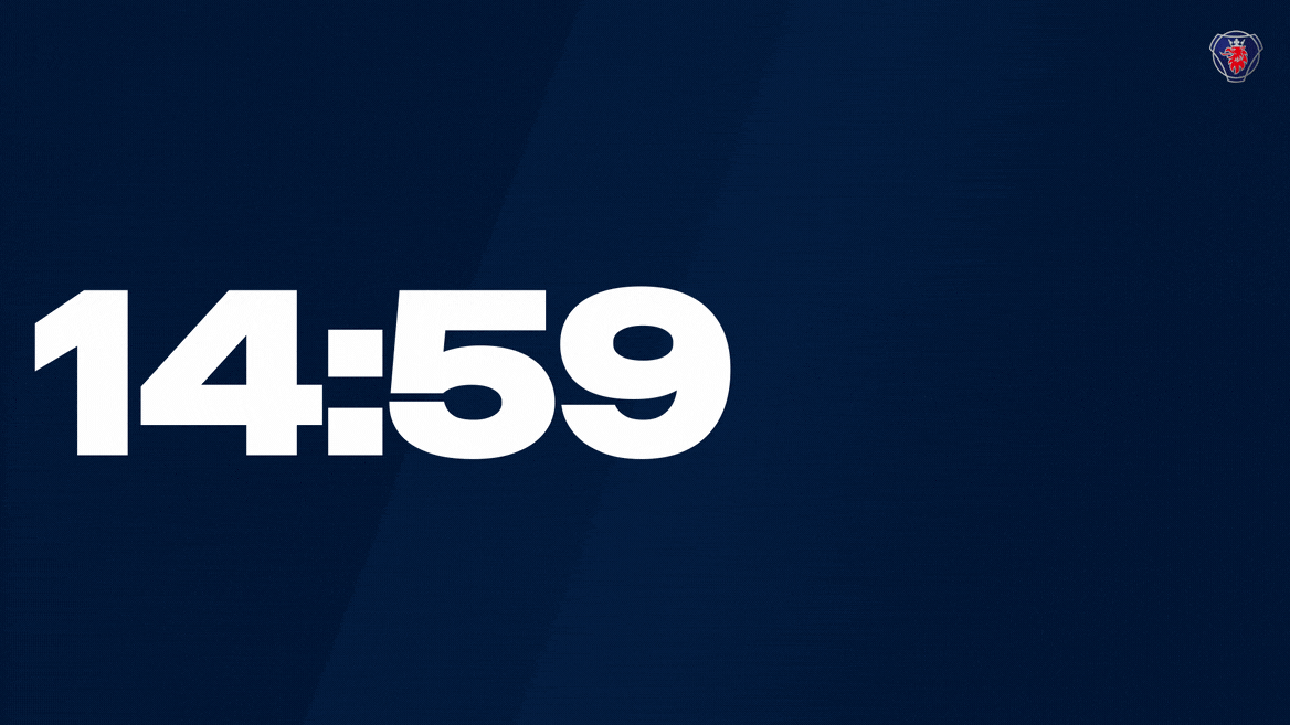
For a coherent expression during events, several ready-to-use unique Scania assets are available for download. The countdown clock (up to 15 minutes) may be used before an event starts (when guests are arriving or participants connecting) and includes a custom sound. Preferably it's combined with the event intro (15 seconds), which is used when the event begins (e.g. when someone enters a stage for a presentation), physically or digitally. This asset also includes a custom sound. The background graphic is a seamless loop animation that can be used over a longer time as a backdrop. It can be used on its own or as a background to text (e.g. in a presentation).
Read more in the general guidelines for events.
Below is a mockup (shortened version) of the event assets combined.
The background graphic is based on The shift element (read more about it here) and adds a bit more life to a background or message.
Please note: The event assets also use gradients, meaning there is a risk of banding (especially in Teams). To prevent banding a subtle grain effect has been added. However, always be mindful of banding when working with the assets. If using the assets in a composition, export with a minimum of 16 bit color depth.
Preview and download
Please note that you need to be logged in with your Scania account to download the logotype files. If you cannot see the download button for the assets below, click the blue button in the header to login.
Please note that all motion assets are produced in 30 fps, do not convert to lower.
PowerPoint
If you want to add more motion to your PowerPoint presentation, the motion principles and guidelines presented on this page should always be followed.
Transition
The default transition is "None". If you want to have a smoother transition between your slides you may instead choose "Fade". Make sure to select all slides before changing transitions, so that the same transition is used between all slides.
Animations
If text or other graphics (e.g. pictograms) are animated on a slide, either use "Appear" (for a rather quick animation) or "Fade" (for a smoother animation). For titles and main messages you may also use "Motion path" (moving Up) to mimic the default motion treatment for typography.
Backgrounds
In PowerPoint presentations the event assets may be included as a video file and used as a background e.g. on the title slide. Don't forget to test your presentation to ensure that your computer may handle the increased file size that included video files cause.
Download the Scania PowerPoint template, instruction and inspiration for presentations on the templates page.
Digital applications
When working with graphics and components, it’s important to work mindfully with the motion primitives. The hierarchy and size of the object play a big role in how choreography, duration and timing are applied. Multiple components living side by side need to work together and share direction in clusters and groups according to hierarchy and logic.
When applying motion to digital components and applications, we avoid unnecessary decorations and adhere to our motion principles, aiming for a straightforward and effective expression.
Read more about the general guidelines for digital design in the Tegel design system and Scania design site.
Example: Components
Attention to small details in digital assets contributes to a cohesive and premium user experience. The precise, engineer-like expression is further enhanced by clearly defined direction even in smaller objects.
Example: Mobile
We work with direction and precision in our movement, and allow clusters to animate together for a smooth and straightforward experience.
Example: Desktop
When scrolling, we use motion to emphasise the natural direction. But we may also animate objects horizontally – as long as there is only one direction at a time and with logical clustering.
Social media
When working with text on social media, keep in mind the short attention span of the audience. It's crucial to consider the duration and length of the message carefully. Make sure to give the viewers enough time to read the text without overwhelming them with too much information.
For longer copy, consider dividing it into several screens. Be cautious when using text on top of footage so that the text is legible. Consider footage or area of the footage with calmer space.
Read more about the general guidelines for social media here.
Simplified treatment
The simplified treatment for social media uses a smooth fade-in and scale. It is suitable in text-heavy content with several messages.
Values:
In: 0.5s, Scale 97% to 100% Enter Ease, Opacity Easy Ease
Out: 0.3s, Scale 100% to 97% Exit Ease, Opacity Easy Ease
Default treatment
The default treatment uses a confident, straightforward animation upwards to create a sense of drive and optimism.
Values:
In: 0.6s, 40px/0.1s offset, Enter Ease
Out: 0.3s, Opacity, Easy Ease
Expressive treatment
The expressive treatment can be applied when using bold typography to match its energy, and to emphasise direction of the content and create a sense of rhythm.
Values:
In: 0.6s, 100px/0.1s-1.0s offset, Enter Ease
Out: 0.3s, Opacity, Easy Ease
More information
Motion may be used in different contexts and situations, e.g. during events, in films and digital applications. Below you find links to read more about these areas.
Contact Scania Identity Helpdesk if you have any questions.