Colours
How would you rate Scania Brand Portal?
All your answers are anonymous.
Colours are an effective and important communication tool. Through a harmonised and systematic use of colours we can both express our brand and provide clear information.
Brand colours
Our brand colours help us differentiate from other brands and are used to create the desired brand expression, recognition and coherence in our communication and other expressions.
Primary colours
The primary colours in Scania's brand colour palette are Scania Blue and Scania White. They are derived from the Scania logotype and are the same colours that we use for the Scania wordmark. This way they are strongly connected to and effectively communicate our brand.
Blue and white should always be visible across any Scania application. They are mainly used for backgrounds and text. We use the blue as text colour on a white background and white text on a blue background.
| RGB HEX CMYK C CMYK U CMYK N Pantone C Pantone U NCS RAL |
4, 30, 66 #041E42 100, 90, 13, 62 100, 90, 5, 55 100, 90, 0, 50 282 C 282 U S 7020-R70B 5013 |
| RGB HEX CMYK C CMYK U Pantone C Pantone U NCS RAL |
250, 250, 250 #FAFAFA 0, 0, 0, 0 0, 0, 0, 0 White C White U S0500-N 9003 |
C = Coated, U = Uncoated, N = Newspaper
Supporting colours
Scania Light Grey, Scania Medium Grey, Scania Dark Grey and Scania Black are supporting colours in the colour palette.
They are selected to support the primary colours. They give the colour palette more flexibility, but they should never be the dominant colour. The supporting colours are used as backgrounds, to colour supporting body or detail text or to highlight words within text.
| RGB HEX CMYK C CMYK U Pantone C Pantone U NCS RAL |
200, 201, 199 #C8C9C7 8, 5, 7, 16 8, 5, 7, 16 Cool Grey 3 C Cool Grey 3 U S2000-N 7047 |
| RGB HEX CMYK C CMYK U Pantone C Pantone U NCS RAL |
151, 153, 155 #97999B 20, 14, 12, 40 20, 14, 12, 40 Cool Grey 7 C Cool Grey 7 U S4500-N 7004 |
| RGB HEX CMYK C CMYK U Pantone C Pantone U NCS RAL |
83, 86, 90 #53565A 56, 47, 41, 46 56, 47, 41, 46 Cool Grey 11 C Cool Grey 11 U S7500-N 7015 |
| RGB HEX CMYK C CMYK U Pantone C Pantone U NCS RAL |
0, 0, 0 #000000 0, 0, 0, 100 0, 0, 0, 100 Black C Black U S 9000-N 9005 |
C = Coated, U = Uncoated
Accent colours
Scania Beige, Scania Green, Scania Pale Green, Scania Orange and Scania Red are accent colours used to vary or highlight content.
The beige and green colours are natural colours, selected to reinforce Scania's image as a grounded, reliable organisation with sustainability at the top of our agenda. Orange is normally associated with news, innovation and power.
Beige, green and orange can also be used sparingly as background colours, to create variation or focus when needed, but never to the same extent as the supporting colours.
Scania Red is derived from the griffin in the Scania symbol, and must hence be used with great care and only as an accent colour, never to steal attention from the griffin. It must never be used as background colour, but is only used for accents and details, for example stictching in textile and other material, or when additional colours are needed in a chart. Red can also be associated with warning signs and negative results (e.g. red numbers in a table).
| RGB HEX CMYK C CMYK U Pantone C Pantone U NCS |
148, 165, 150 #94A596 40, 15, 35, 10 40, 15, 35, 10 5635 C 5645 U S4010-G10Y |
| RGB HEX CMYK C CMYK U Pantone C Pantone U NCS |
44, 82, 52 #2C5234 80, 21, 79, 64 80, 15, 80, 55 350 C 350 U S7020-G10Y |
| RGB HEX CMYK C CMYK U Pantone C Pantone U NCS |
206, 184, 136 #CEB888 15, 24, 49, 3 15, 24, 49, 3 7502 C 7501 U S2020-Y10R |
| RGB HEX CMYK C CMYK U Pantone C Pantone U NCS RAL* |
227, 82, 5 #E35205 0, 75, 100, 0 0, 60, 95, 0 166 C 166 U S1080-Y60R 2002** 2004*** |
| RGB HEX CMYK C CMYK U Pantone C Pantone U NCS RAL |
214, 0, 28 #D6001C 0, 100, 90, 3 0, 100, 80, 0 2035 C 2035 U S1085-Y90R 3028 |
*) For Power Solutions
**) Standard engines
***) Exhibition engines
C = Coated, U = Uncoated
Silver foil
Silver is derived from the crown and hub in the Scania symbol and may be used as metallic PMS or silver foil. It may for example be used for special prints where the monochrome Scania logotype and a limited amount of any associated text may may be reproduced using print techniques to print silver.
We can use silver as a metallic PMS Silver C or as a silver foil (Kurz Alufin Satingloss RAL 9006). Never simulate silver in digital applications or in CMYK print methods.
Data visualisation
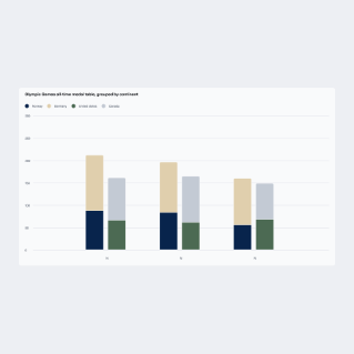
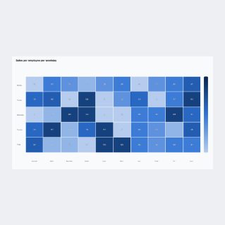
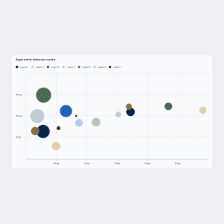
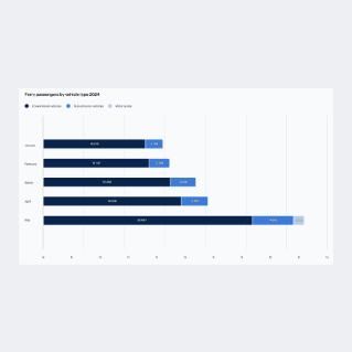
When presenting data we need to ensure that our visualisations are recognisable (consistent and on brand), understandable and accessible. To achieve this, the Scania brand colours have been translated and adapted to three different colour palettes for data visualisation, to cater for different types of data and scales of measurements.
Some examples:
The categorical palette is used for nominal data or measurements that represents distinct categories or groups. Each colour in the palette is distinct and easily distinguishable from the others. The palette is designed to be used in the order as presented below.
Regions, markets and maps
To ensure that we always use the same colours for markets and regions in all our publications and communication, the regions and colours as defined by the BQ meeting and Commercial Operations (CO) governance should always be used.
Read more about Regions and markets on Reflex.
For other maps, visit the Map guidelines in the Tegel design system to read more about infographic maps (for presentations and marketing material), interactive maps (for finding locations) and maps for navigation and bespoke digital applications.
More information about the other colour palettes for data visualisation, as well as colour codes for dark mode is available in the Tegel design system.
Semantic colours
Semantic colors communicate important statuses to the user such as information, success, warning or error. They essentially have a functional purpose, therefore they shouldn’t be used as decoration or as a background colour on large surfaces.
Information
HEX #2B70D3
Positive
HEX #1DAB8B
Warning
HEX #F1C21B
Negative
HEX #FF2340
Read more about the use of colours in digital appliations on Tegel design system.
Digital applications
Our brand colours are the main colours to use to represent and express our brand, for example in marketing communication and presentations.
However, in digital contexts additional colours are needed to create a good user experience. Hence, for digital applications colours from the blue and grey colour scales, as well as the semantic colours, may be used. Visit Tegel Design System for more information..
Colour contrast
When using copy on coloured backgrounds we use text colours that contrast the background to ensure legibility.
Read more about legibility in digital applications in the Tegel design system.
Colour usage ratios
By limiting the number of colours that each application uses we create harmonious colour pairings. Either one of our primary colours must always be the dominant colour across all applications. Use these example colour usage ratios as a guide when creating your own colour pairings.
For colour usage on websites the primary palette colours lead for backgrounds and text, with supporting palette used for secondary copy and colour scales.
Scania Blue and White used as background colours with supporting and accent colours, used for example in PowerPoint charts.
Product and theme colours
For physical products and in communication of physical products and specific technologies there might be special needs and purposes with the use of colours.
The following sections describe the rules for that.
Theme colours
Besides the Scania colour palette and additional colours for digital design, no other colours must be used in communication.
Some products, solutions and technologies are however strongly connected to a certain colour, hence in some cases the use of such a colour may be motivated for a limited and/or temporary use - to create recognition and a connection to a certain product or solution. We call these colours Theme colours. Examples are Power Solutions engines, XT and V8, where the colours orange and red may be used to a somewhat larger extent in communication about these products, than what is normally allowed. Another example is the light blue colour for BEV/electric trucks.
Guidelines:
- Theme colours always fulfil a purpose (e.g. to signal that a vehicle is electric)
- Theme colours are typically connected to a physical product (e.g. vehicle) or technology (e.g. electrification)
- To remain a clear brand recognition, a theme colour must never be the dominating colour, but that should always be the primary and supporting colours from the Scania colour palette.
- Theme colours may only be used as accent colours, to highlight details and certain graphics.
- Theme colours must never be used for text or backgrounds.
- Theme colours must never be used if the only purpose is to make the communication differ from other Scania communication. Instead of clarification and recognition there is only a risk to confuse the receiver.
- Theme colours must never be used for interaction elements (in digital design/applications).
New theme colours must always be approved by Brand Management at Scania head office before use.
Below are the approved theme colours.
Ruby Red (V8)
Mainly visualised in communication via the use of red trucks and the V8 symbol. See campaign material and content books for more information.
Colour codes for accents/graphics:
Pantone 202C, CMYK 10, 100, 61, 50, RGB 110, 0, 45
Scania Orange (Power Solutions engines and XT)
Often visualised in communication via product images (of orange engines and XT trucks/symbols respectively). See campaign material and content books for more information.
Colour codes for accents/graphics:
Pantone 166C, CMYK 0, 75, 100, 0, RGB 227, 82, 5
Glacier Blue (BEV/electrification)
Often visualised in communication via product images (e.g. blue details on BEV truck).
Colour codes for accents/graphics:
Pantone 2148 C, CMYK 65, 34, 17, 0, RGB 97, 145, 180
Below are some examples of how the theme colours may be used.
Launch and exhibition vehicles
A colour used for launch and exhibition vehicles is normally not the same and don't need to be any of the brand colours. The colour is normally only used temporarily, in connection to the launch or exhibition. The colour needs however to be selected carefully after joint discussions between the project team, Brand management, Product design, Cab production and possibly any other relevant and concerned function. For local exhibitions, the local organisation should also be involved.
The reason for having a specific launch colour is normally to signal something new, communicate according to the project objectives and empahise the product design. A reason for having a specific exhibition colour is to use the colour as a connecting element between the different exhibition units (vehicles).
A launch colour is often a new and unique colour, specifically developed for the product launch, while an exhibition colour normally is one of the existing vehicle/cab colours.
Some things to take into account when choosing a launch or exhibition colour:
- Communication strategy and project objectives
- What the colour stands for/what associations it gives
- A colour that suits and emphasises the product design
- A colour that is suitable for photography
- Cost, technical and production aspects
- Other colours recently used, both by ourselves and competitors
A launch or exhibition colour is sometimes also complemented with specific vehicle striping or marking, e.g. to further highlight or emphasise certain product attributes or technologies.
Don'ts
Download
By downloading any of the colour swatches below, you accept the conditions set out under Legal notice.
Colour codes for the blue and grey colour scales as well as semantic colours are available in the Tegel design system.
Contact Scania Identity Helpdesk if you have any questions.


