Internal communication
This page contains guidelines and advice on using our brand and identity guidelines and assets to create clear and professional internal communication.
As a foundation, all guidelines regarding the Scania brand and identity available in the brand portal are also valid for internal communication, e.g. Scania’s brand platform, tone of voice and our brand elements. Scania is a premium brand, and that must be reflected in all our communication.

A coherent visual identity is important for several reasons. For example, it’s reassuring, signals reliable information from Scania, and it allows the recipient to focus on the message. Using clear and structured design and layouts also help the recipient to find relevant information more easily, without decoding different graphic expressions or colours.
Elements for visualisation
To visualise or highlight different topics or sections, we can use various graphic elements, e.g. images (photos), pictograms, and colours. The graphic elements can be used for different purposes, e.g. creating attention, reinforcing a message, establishing a feeling or explaining complex content. Irrespective of which graphic element is used, it's important to always use Scania's brand assets, following the Scania look and feel and other guidelines.
Images
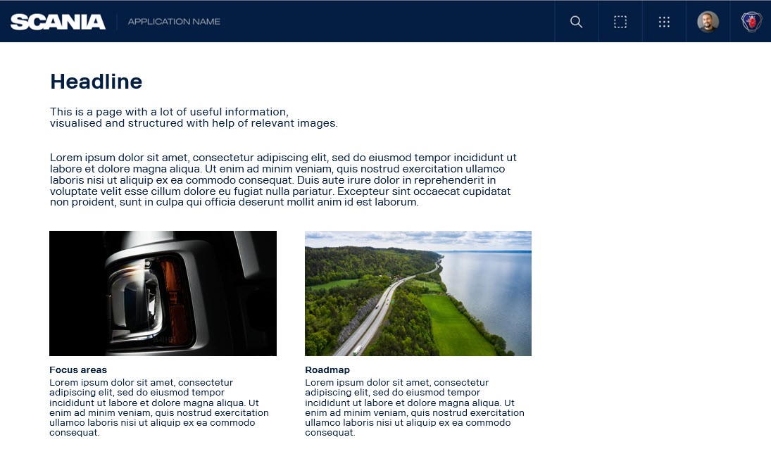
Images are often the preferred graphic assets, since they have a great effect creating attention, recognition or evoking a feeling. Images can also make the content feel more real and relevant. Read more about Scania images in the Imagery guidelines and download Scania images from our image library in Scania Media Provider.
Pictograms
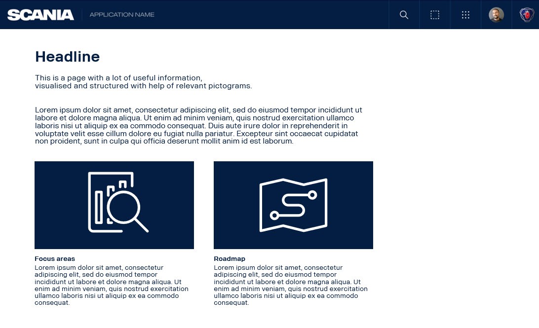
Pictograms can be used to structure or explain complex content or when many visualising graphic assets are needed, and using different images risks creating a cluttered impression. Pictograms can also be useful when a suitable image is not available or when a sensitive topic is to be visualised. Read more about and download Scania pictograms on the Pictograms page.
Illustrations
When neither real photography nor pictograms are suitable, illustrations could be an option. This could be when visualising future scenarios – such as city transport systems, information flows or environments that don't yet exist. In these cases, illustrations may be used to complement text and images, and help bring abstract concepts to life. Read more about the Scania illustration concept.
Colours
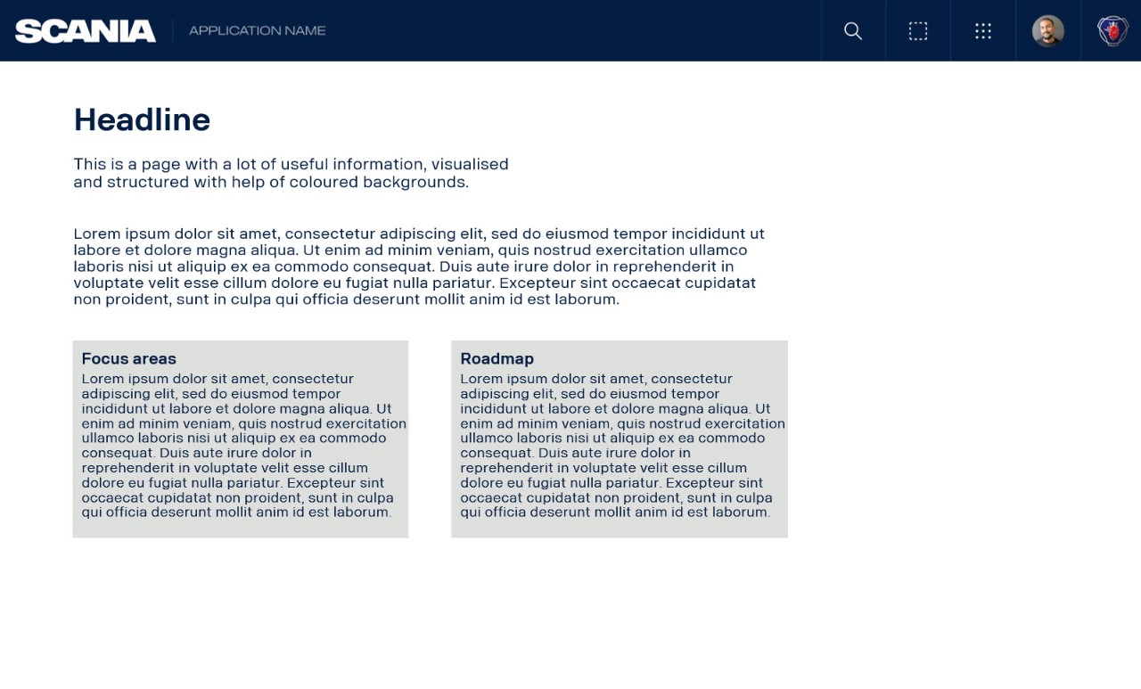
Colours can, for example, be used for backgrounds, to group information, to divide sections or to highlight a specific text section. For an uncluttered and professional impression, stick to a minimum of colours, preferably only the primary colours (blue and white), complemented by the supporting colours (in grey) if needed. Also make sure that there is enough contrast when using text on coloured backgrounds to ensure legibility. Read more about the Scania colours on the Colours page.
Images, text, pictograms and other graphics can also be combined to create informative Infographics. Read more on the Infographics page.
Below are examples of how images, pictograms or coloured backgrounds can be used to visualise and structure the content (click to enlarge the images).
Selecting images
When selecting and using images for your communication, it is strongly recommended that you only use images available our own media library in Scania Media Provider. This way, we can ensure that the images are professional, relevant, authentic and unique for Scania – and that we have the correct user rights. Using real Scania images is important from a recipient's point of view, since it signals that it's trustworthy and professional Scania communication that it is real and relevant for the target group.
In internal communication other kinds of images are often needed, unlike external communication, where we often communicate about our marketed products and solutions. Please note that besides many good product images (e.g. of trucks), our image library also contains a lot of other useful images, such as images of different environments, our operations, equipment and people.
Below are some examples of images (click to enlarge) from Scania Media Provider that can be useful in internal communication.
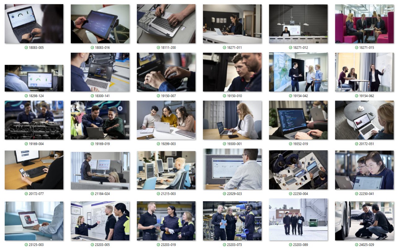
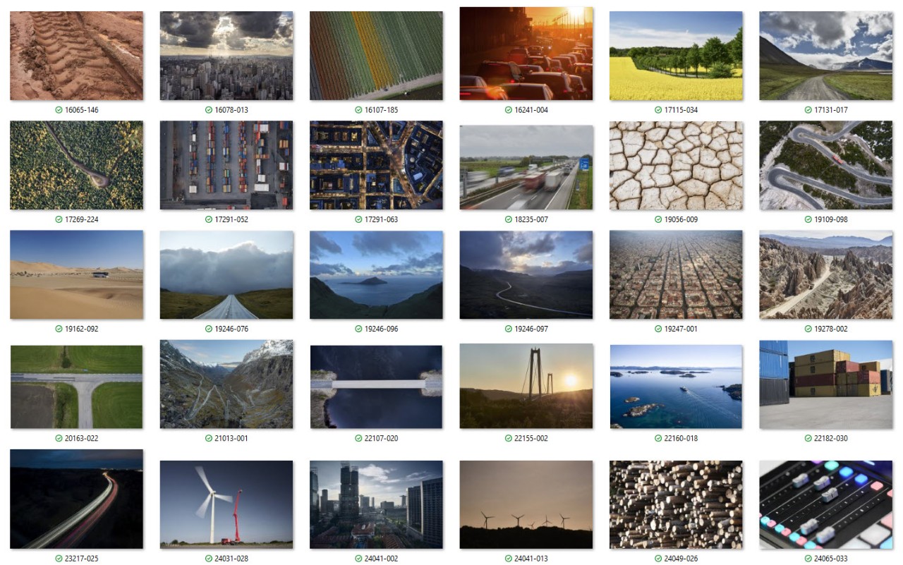
To find more images of people in different situations you can use the following words in the search field: people, man, woman, driver, customer, employee etc. or a combination of them (e.g. woman and driver). You can also search for the following image number series in Scania Media Provider:
12067*, 12176*, 16041, 18001, 18083, 18159, 18271, 18292, 18298, 18300, 19073, 19150, 19154, 19169, 19192, 19299, 19352, 20172, 21162, 21174, 21184, 21201, 21215, 22029, 22060, 22066, 22095, 22136, 22250, 23125, 23203, 24025, 25106, 25150, 25202, 25209, 25210, 25215, 25216, 25222
*) May only be used in internal communication.
If you don't get any search results, add a * after the number and/or check your access level.
Please note that if an image is marked "Restriction" that image may most likely not be used, but you can read more about what kind of restriction the image has, and if there is a contact person that you can contact to ask for permission to use the image.
Click the sections below to learn more about searching for and finding useful images in the Scania Media Provider, access levels and the use of other images.
Below are some tips on how to find suitable images in Scania Media Provider.
- Log in
When searching for images in the image library, make sure to first login with your Scania account. This way you can access about 50,000 images (instead of about 1,000 images if not logged in).
- Use filter
- Filter for type of media, e.g. choose “Image” to only view images (and not films and documents).
- Choose Area of interest, e.g. “Truck”, “Research and Development” or “Sustainability”. You can also choose “Corporate Identity” > “Photographers choice” to find our own photographers' best image selections.
- Use the search field to find specific images, e.g. search for
- "General motif" - to find motifs of other things than our traditional operations and products (e.g. roads, landscape, nature, cities, animals, signs etc.).
- "People", "eb_drive" and "customer"- to find images of people with written consent (GDPR approval) - just make sure that the image is not tagged with "Restriction".
- “Computer” or “office” - to find images often useful in internal communication.
- “Aerial” - to find useful images of different environments, both roads, nature and cities.
- A combination of words by using AND, e.g. "city AND night" to find images of cities shot at night or by using NOT, e.g. "customer NOT truck" to exclude images of only trucks (not including a person).
- The first five digits in an image number, to find more similar images (but for example from another angle).
- Need an image to visualise holiday?
Use an image of a summer or winter landscape. There are also specific images available for different seasonal greetings (search for "seasonal greetings").
- Need an image for HR/P&C info or similar?
Use an image of people, computer or an office landscape.
If you need to illustrate a sensitive topic, connected to mental health or other personal issues, use a photo where the person can’t be identified (for example a person seen from behind or where only the hands are visible, e.g. image 24217-084, 23125-002, 19088-004 or 18083-005) – or choose a Scania pictogram or illustration instead, to avoid linking specific employees to these subjects.
Learn more about search and download in Scania Media Provider on Reflex.
If you work a lot with communication and are often in need of different images, you can apply for access level 2 (level 3 is standard, for all Scania employees), to be able to access more images. Read more about how to apply for access on Reflex.
As already mentioned, it is strongly recommended to only use images from Scania Media Provider. This way we can ensure that all brand, safety and legal aspects are fulfilled. For example:
Imagery guidelines
All images need to follow Scania imagery guidelines, i.e. be authentic, professional, of good quality etc.
Photo permit
A documented photo permit is required for photographing within Scania. Read more on Reflex.
Written consent
Images with people normally requires a written consent from the persons portrayed in the image. An exception is if an image only features Scania employees and if it is only used in internal communication. Then a written consent might not be needed, but the persons appearing in the image must have the opportunity to deny the use of the image. Please note that if the image will be used in any external channel a written consent is always needed. Read more on Reflex.
Copyright
In photography copyright means that the person who shot or created an image also owns the image. Exceptions include if Scania hires or employs a person to take photos for Scania. Then there is normally a written agreement giving Scania the copyright. Hence, Scania normally don't have the copyright to images that are shot by other employees than persons that are employed as photographers.
User rights
At Scania we can use all images available in Scania Media Provider without limitations (except if an image is marked with "Restriction"). If using images from an external source user rights may be restricted, e.g. for a certain time period or region.
Safety aspects
In many situations there are a lot of safety aspects, laws and regulations that need to be followed (and shown in the images), for example wearing the correct safety equipment (helmet, gloves, glasses etc.) and seat belt, using the correct equipment and working ergonomically.
AI-generated images
Besides following the Scania imagery look and feel, copyright, legal and safety issues also need to be considered when creating images with help from AI. Read more on the Artificial Intelligence page.
If you cannot find a suitable image, you can also contact imagedesk@scania.com for support. They have access to all images available in the media library and can suggest a suitable image for your need.
Learn more about log in, search and download in Scania Media Provider on Reflex.
Text
Divide your text into sections and chapters with separate headlines to make it easy to read and follow. Use different headline sizes to create clear hierarchies, but stick to a maximum of three.
Headlines are set in bold, and body text is regular. Any preambles are set in a slightly bigger size than the body text.
A small amount of text could be highlighted using italics or bold (if one or a few words) or adding a grey background to the text section. Avoid mixing different formatting (e.g. don't mix bold, italic and underlined text). Read more about text on the Typography page.
Use pre-defined settings
When using a template (e.g. the Scania PowerPoint template) or application, always use the pre-defined settings for text, i.e. size for headlines and body text.
Presentations
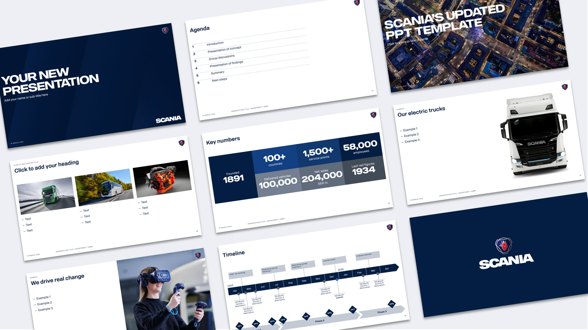
When creating presentations and documents in PowerPoint, always use the Scania template and the pre-defined settings for headlines and text. The template includes some basic layouts, such as title slides, chapter dividers, content slides, and the last slide with the Scania logotype. Images, pictograms, and different backgrounds and shapes can be added to create more variation and to visualise the content. Use the gridlines and guide to create alignment and structure.
If you have the Scania template (with the specific Scania menu) installed, you can easily use the built-in image bank to quickly insert Scania images in your presentation. You can also use the button for Scania pictograms as a direct link to download the pictograms from the brand portal.
Below are some examples of how different graphics can be used in a PowerPoint presentation (click to enlarge images).


More examples and inspiration are available in the file “Inspiration” which may be downloaded below, together with the file “Instruction” which provides more information about the PowerPoint template.
Inspiration file and instruction
Digital applications
When working in an application, always follow the guidelines for the application, e.g. when it comes to grid and text settings.
As always, it is essential to select images that support the message and contribute to clear and professional communication, also when selecting images for digital applications (e.g. Reflex and Sharepoint). Try to find images or graphic elements that are relevant and uniform. Keep the number of different formats, different kinds of images, graphic elements and colours to a minimum to avoid a cluttered impression. Also make sure to structure the content in a good way to make it easy for the user to understand the content and follow the information.
For pages containing a lot of information, different graphic elements can be used to help create a clear hierarchy and structure. For example, a large image can be used at the top to visualise the overall topic of the page and to convey a certain feeling. For sub-topics, link cards, and similar, small uniform images or pictograms can be used to visualise the topic. If possible, avoid mixing pictograms with illustrations or images for information on the same level.
Use real and relevant Scania images and pictograms in a few different formats and a structured layout to visualise different topics.
Use generic stock images or non-Scania pictograms and illustrations.
Use a grid system and headlines in a structured way to organise the content, create clear hierarchies and present the information in a precise and reliable way.
Place content in an unstructured way or use many different layouts and sizes for content and text.
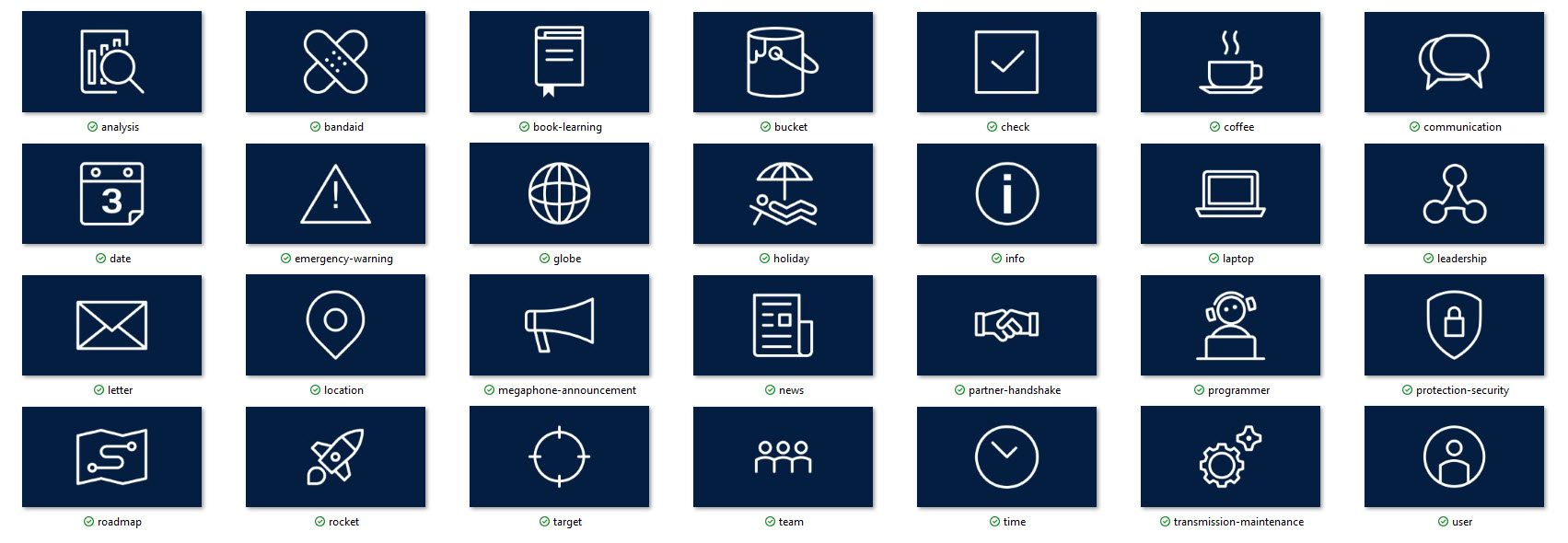
Pictograms in applications
Pictograms can be used to structure content, but also to create recognition for a certain type of information that might be communicated regularly in internal applications. The pictograms can either be used with a transparent background (then the pictogram is normally blue) or with a coloured background, e.g. a white pictogram on a Scania Blue background. When several pictograms are used together, the background colour should preferably be the same.
Below are some commonly used pictograms with a Scania Blue background in 16:9 format available for download.
Learn more
Below are some useful links for further guidance and support.
Tegel Design System – for all digital applications at Scania
Scania design – for design inspiration
Reflex content guidelines – writing tips for Reflex
Reflex design guidelines – design and layout tips for Reflex
Emails
To ensure that newsletters, information, system notifications etc. sent via email not only are visually appealing and recognisable, but also accessible and perform well across different devices and email clients, all such Scania emails should adhere to our key best practices. Read more on the page regarding email design.
Creating recognition
Scania pursues a single brand strategy and the Scania brand is always the same, regardless of geographical market or product segment. In practice we don't create different logotypes or graphic expressions for different products, departments, applications or other initiatives – but we all use the same graphic profile, independent of what we communicate about. We are all part of Scania, which should also be reflected in our communication and visual expressions.
From a recipient perspective it's also reassuring when you easily recognise that it is trustworthy communication from Scania. Focus could be kept on the actual message and content instead of decoding a different visual appearance. It's also important from a brand perspective, and that we all contribute to developing our brand by filling it with all the good initiatives that we work with and, by doing that, also creating pride among our employees.
By using the available assets in the brand identity toolbox, you can also focus on the actual content, making sure it's clear and professional in every way, helping you to achieve your communication objectives.
Using a recurring image
With the single brand strategy in mind, there could still be a need to create recognition for a certain topic. For example, when communicating about a certain initiative or project on a regular basis. To achieve this while still conforming to our single brand strategy, you can choose a "hero image", that is relevant to your topic and reinforces the message. You can use it repeatedly in your communication as a clear "identifier" for your topic. For example, you can use it on the title slide of a presentation, as a top banner in emails, as a thumbnail or image in Reflex News, etc.
Below are examples of how recognition is created by using the same image in different contexts.
When the employer branding strategy and communication concept Drive was developed and launched, an image of a female service technician was used repeatedly in all communication regarding the project, for example as title slide in presentations, news and on the final page with all the guidelines.
A holistic image with some supporting pictograms is used in the communication for the Travel transformation programme, to create recognition in emails, Reflex etc.
For all announcements about top management appointments, the same image is always used for quick and easy recognition of what kind of information the communication is about.
Below are some examples of pictograms that also could be used for news or information updates that are published on a regular basis, for example release notes, organisational changes etc.
Templates
Use the templates available for download below to create an ad or invitation for an event. Templates are available in PowerPoint and InDesign.
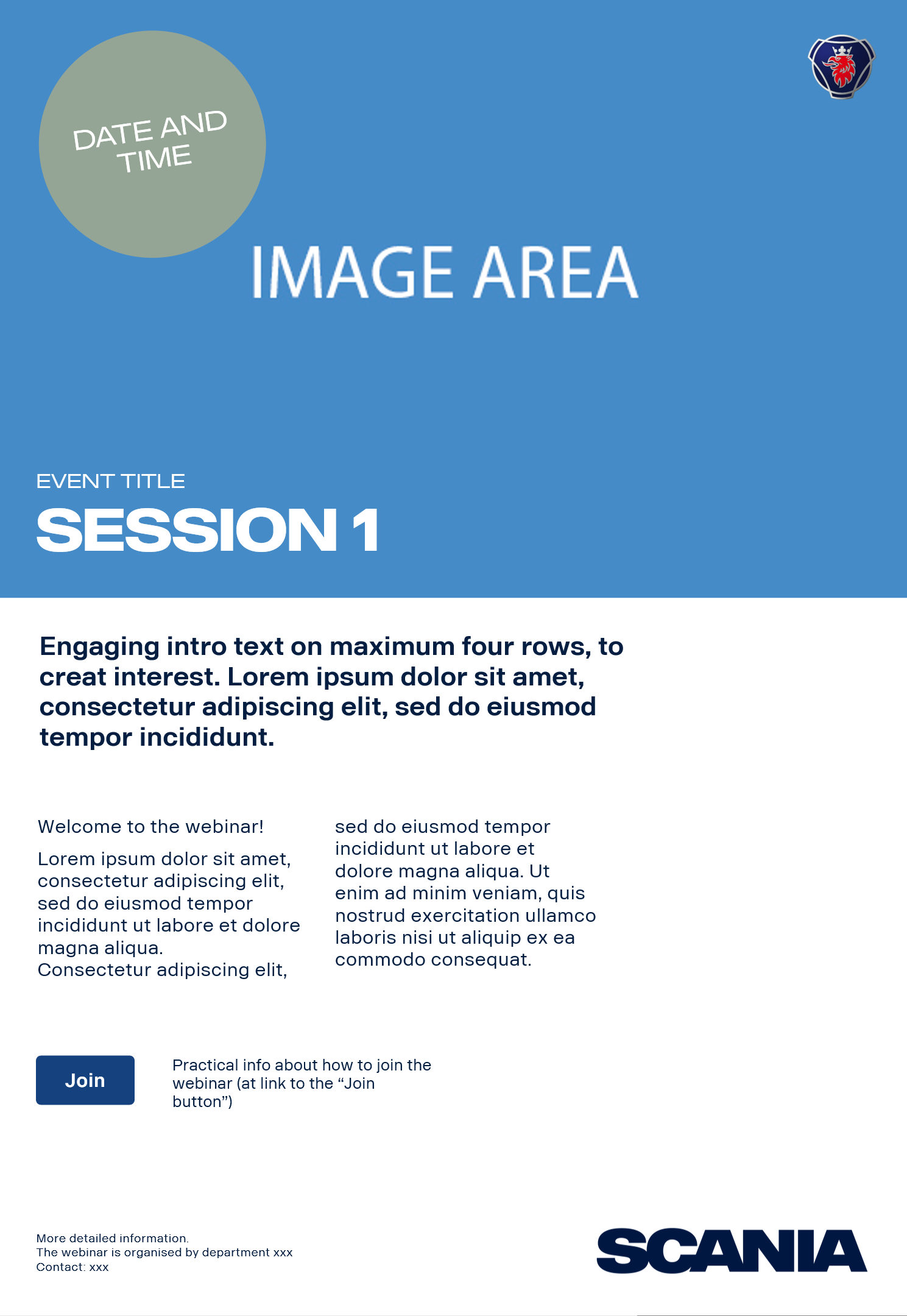
More templates for events, display and other kinds of communication are available on the Templates page.
Support
Should you need any further support, don't hesitate to contact the Scania Identity Helpdesk.